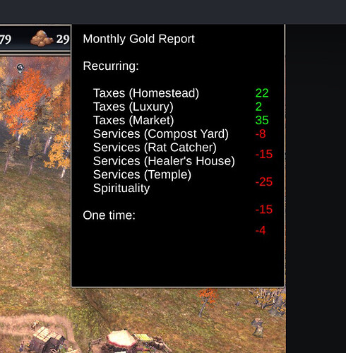
I normally play on 1.8x UI scaling. This is what it looks like when I hover over the gold report. Values don’t line up, making it really hard to figure out.
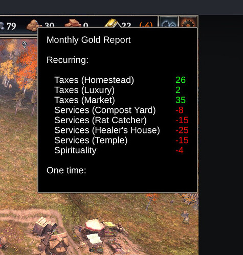
Tested this issue on 2x scaling and this is what it looks like, which I think is correct alignment.
Related note - I’m lazy. It would be nice if it summed up the credits and debits and gave me an overall result so its obvious if I’m running in the red.

