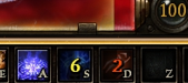
Currently, the cooldown numbers in the toolbar are color-coded like this:
white for 9+ seconds, yellow for 5-8 seconds, red for 1-4 seconds.
My minor but helpful UX suggestion is to:
Swap the colors so that big numbers are red, and small numbers are white.
The reason I believe this helps the player is because white is brighter and contrasts more with the black background of the skill icon. It’s easier to spot in peripheral vision, and gives a better impression the skill is almost ready to cast again.
A suggestion to change the cooldown colors came up in the playtest discussion already, but for a different reason.
Our reasoning to switch the colors around was that the order white->yellow->red can be counter-intuitive for anyone who drives a car Crate obviously did not agree, they even doubled down and renamed the tags to correspond to the colors being used, so chances of them changing the colors to something else aren’t very high. I still hope they do, your suggestion makes sense too.
However, if you are using rainbow filter or otherwise extracted the file /settings/text_en/tags_ui.txt, you can fix it by yourself. Look for this block:
^W = white, ^R = red, ^Y = yellow, ^G = green. Other colors can be used, a full list is available in the rainbow filter tool and also somewhere in the thread.
I didn’t realize this had already been discussed before. I did search the forum before creating this post, but found nothing.
You’re right; I even forgot about the white. So currently it’s: white for 9+ seconds, yellow for 5-8 seconds, red for 1-4 seconds. In this case white is the highest contrast color, yellow the second highest, and red is significantly darker and harder to read in peripheral vision (against a dark background ofc). Personally I would swap red with white then. But hey if it’s already been discussed I’m not going to beat the dead horse. It’s not a big deal enough for me to install mods over.
If anything, it could be the skill icon itself flashing on zero. I think either World of Warcraft or Lineage do that with their skill UIs (together with a sound cue). But those games usually have strictly longer cooldowns than GD where some build may have cooldowns of 0.5 seconds; and that may be a problem.
So flashing might be a bit too intrusive / distractive, but I guess it depends on how it’s done.