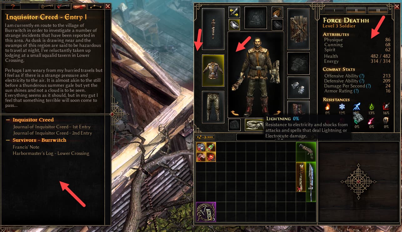
Overall I like the look, but my initial reaction to the Character Screen and the Quest Log is that the background is too dark. Why I’m thinking a medium brown / leather color feel would be better - I’m not sure. Just my initial thought.
Image with arrows on areas I think are too dark.
Edit: as I think more on it the contrast of the text on the dark background seems stark/jarring.
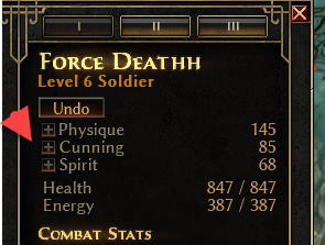
Edit 2: The plus buttons next to the Stats are hard to see. See second image. This is after I select skill points and can still undo them. The plus buttons are hard to see.
Just piggybacking off this UI post. I only put an hour in, but wanted to do initial feedback that the Quest Log / Lore Notes tab is very drab compared to the old version: the parchment look with red/brown/black text. I don’t miss the texturing of character stats window, but maybe something simple for that background too?
If the goal was to have both sheets similar, working on dark backgrounds… hmm… I’ll dwell on it.
don’t think it/the "dark mode"black looks that great, naturally prefer the og/“old grump”, but this probably wouldn’t be bad either, to use the “wood” from locked inventory slot