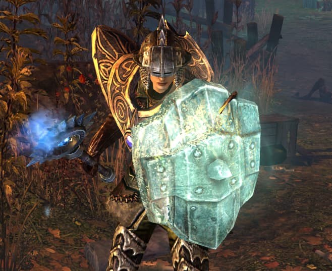
It seems that there has been a change in the stance of characters in the main menu screen. They used to be in their idle/chill-out stance. Now they are in their ready-for-action crouch (unsure of correct term). I think the latter doesn’t look as good as the former. This is subjective, of course, but what isn’t subjective is the fact that the ready-for-action stance introduces clipping in some cases (see below: Magi Mantle + Spectral War Shield).
The images of characters in the main menu are the highest quality that a player ever sees and it’s a shame for them to be borked like this. I think the idle stances generally don’t have this problem (or, at least, it’s much more subtle).
I agree that clipping is distracting (plus some characters’ faces are completely hidden behind hat like helmets). I don’t mind battle stance tho if it wasn’t for the buggy looks.
This is good. What about unarmed characters? currently my weaponless mules all have their fists up like they’re ready to box. Actually, upon further inspection, its just the sword/shield stance. I don’t know why I imagined them boxing but that was the first thing that came to mind.
Regardless, I think a neutral stand would best fit those characters