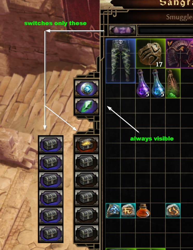
The dedicated tabs are really welcome. I do feel however that it’s unfriendly to use because they’re shared tabs. Gameplay wise this is very much desired so you only deal with one each. But accessing them I find really annoying. I do not ever use shared tabs unless I have things I want to store globally unrelated to the current character. The components tab is also the main tab I look at whenever I’m managing my stash in the first place, similar to the Currency tab in PoE1/2. This create an interaction that doesn’t feel nice at all.
- You have to click the personal/transfer button to go to your component tab rather than click the component tab button itself.
- If the last transfer tab you opened is not the component tab, you need to click the transfer tab switch, then the component tab button.
What I’d want to see is that the two tabs are always visible regardless of tab mode so either can be clicked/accessed directly when opening your stash. As an additional result, the look of the tabs column also doesn’t need to jump because two tabs are removed visually when in local mode.
Here’s a rough example of what it could look like. Maybe they don’t even need to separate themselves, just the purple color indicator.
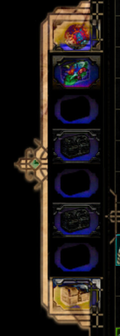
If you use in-game UI scaling this would also remove the slight shift due to the scale differences between both even-though they should be in the same place. Unless this is tied to another issue to be solved. Here’s an example in difference mode where you can see two buttons mismatch.