Uh after I took a closer look I realized that it actually means how the factor will impact the yield of the selected crop. A downward arrow means it reduces the yield, vice versa.
Clover also has yield; it just can’t be harvested. Increase the fertility of your field to 75%~80%, and then you should see the arrow pointing up when you select pea and pointing down with rye.
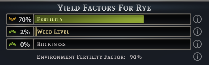
In that case if you are saying that I need to increase fertility to 75 - 80% that means that the arrow represents the amount of fertility itself for the whole field not the fertility impact of that particular crop. So it should not matter what crop I select, I will always see the same arrow. Which in turn would not make sense to have that feature to begin with.
In fact, I have just checked all my fields and their individual crops by selecting each one of them, and even though the subheading reads “Yield factors for [crop name]”, the information below for fertility, weed level and rockiness remains unchanged.
That to me indicates that this information relates to the field itself as a whole for the entire lifecycle rather than the crop itself, and the subheading “Yield factors for [crop name]” is missleading and not working as intended.
The percentages of fertility, weed level and rockiness in the graph are the attributes of the field while the arrows in front of them indicate how these percentages impact the yield of the crop. Crops with higher fertility dependence require higher fertility level for it to have a positive impact, so for example 80% fertility may increase the yield of peas but reduce the yield of rye.
Okaaay okay okay, now that makes sense! and I was able to check by looking at carrots and cabbages in a field with 85% fertility. The arrow changed.
Thank you so much you made my day!