Why change the graphics for blade spirit? now it looks awful and purely screen clutter. they are almost completely Opaque. good reason to stop using them.
I don’t really understand, why the title “is this a joke”, when u have certain question…
It would be better to rewrite like: Graphics of Blade Spirit changed or somthing similar…
Further this thread is usless, they won’t change blade spirit IMO. Nothing to do u use it or not with the graphics, still u can spam devo with them… So useful. One of the best spam king skill IMO.
before patch: blade spirit is too bloated. After patch : blade spirit is too transparent…
impossible to satisfy everybody
The solution is clearly to replace the graphics with a lawnmower.
1 Like
people don’t have to agree, but the new graphics are awful. And opaque is the opposite of transparent.
The graphics were fine before, now its an eyesore and visual clutter.
You are of course free to say what you think, but still people like the new FX’s - why do you think you have the objective truth? it is all a matter of taste.
You can change the name of the thread btw to something more descriptive like “I do not like the new FX fo blade spirit”
sorry it was probably a bit of an overreaction, but was a bit of a shock when i logged into my blademaster and saw them. I never claim to have an objective truth, this is some weird attempt to bait me? all opinions are subjective. Besides does the fact that some other people like them invalidate my own opinion in some way?
Let’s just put this here then for context:
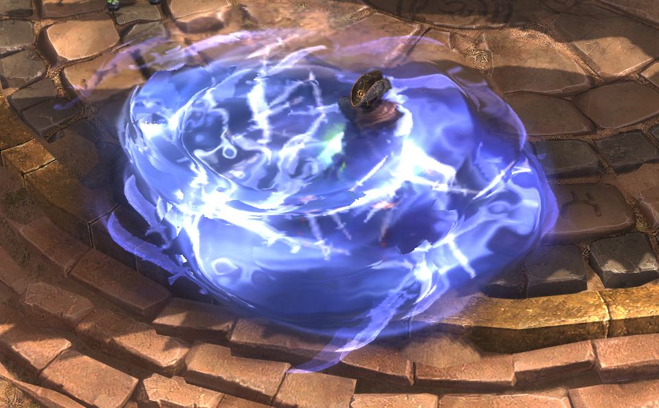
Blowout = that ‘big, white, bright, blob’ you get when many effects overlay each other.
Now, I’m not a big Blade Spirit user and it has been a while since I last used it but apparently by reading this Blade Spirit was prone to “blowout” in areas of the game that were already naturally brighter than other areas of the game.
With that in mind it then makes more sense why they would lean toward a more opaque look versus transparent.
1 Like
Well, i kinda love the new Animations / FX Blade-Spirit looks sick… but that counts for many updated FX’s.
+1, new Spirits is the only FX change that I don’t like. I even started another thread. I won’t be surprised if someone starts another.
Because they look plain awful, and it goes beyond a matter of taste. The swirling blades look pixelated on this navy blue, opaque background. You can hardly see any blades at all. Just this blob. Anyone stands on it, you can’t see them. Environment, you can’t see it. How can a blob of pixelated something that obscures true artwork of the game be appreciated my anyone aesthetically, I don’t know. I think those who say they love it are either trolling or have a pinch of love too much in their hearts.
1 Like
I like the new FX, could be a bit more transparent. That’s all.
1 Like
If you showed it to anyone who never played GD what do you think they’d say that is?
A) Snots & Swords
B) A crack in LCD
C) “Water.” by Jackson Pollock (1952)
I wouldn’t show it fully zoomed and not centered on my toon. 
I like it a lot more than the old “Helicopter Blades”.
yeah right there with you, there is some weird pixellation going on even on max graphics settings. A bit more transparency though would be nice. Im not using them at the moment, i find they are just too visually cluttering now.
I don’t really play with Nightblades and I don’t use Blade Spirits, but they do look better now compared to before imo.
Could they be made better? sure. But that applies to everything.
They look pretty good to me now. Phantasmal Blades look worse than before.