Since vertical screen real estate is so much more valuable within this genre (particularly since the advent of widescreen gaming), why not stick the UI up the sides of the screen? We can already see so much less vertically than horizontally, this would correct that a bit.
Well, I think vertical HP bars are okay, but if that’s the case, then I highly recommend having the ability to add a personal HP bar above/below the character itself.
Also, in regards to the actual change, I personally think the new bar has a bit too much light reflecting on it. And the colors both seem a bit too brown/gold for me. Perhaps a recolor in silver? Or a dark grey, maybe. I can’t say that I’m a big fan of the bronze/gold color. Lastly, the new energy bar color feels too green. The older one has a bit more turquoise or cyan added to the green, which looks like a better “energy” bar to me.
Just my opinion on it!
@Xiphan
I’m sorry to say is not my ability to read is lazy but your ability to think it’s even worst.
First and foremost why the hell would they have a NEW HUD art design which is basically just re-skinning?. Why the hell waste time on making a new HUD art design IF there are plans on reworking on the HUD?
So time had passed and discussions are just for the sake of discussions. Feedback is not really important and basically they can just cleverly re-skin the HUD and call it finalized?
There’s no time to waste and what not there are cost incurred and it’s not a concept art or anything. As a public funded project, you wouldn’t want to waste time on something that is going to change. Just call it finalized with this re-skinning and whether if anyone’s like it or not, said it’s Crate decision. Case closed.
@ Archavan
Well, when trying to make a new HUD or art in general, it’s always nice to try things and see how it turns out. I don’t have any problem with them skinning the HUD over and over until they find one which they see fit and which the community sees fit. It doesn’t hurt to show people it. If everyone hated it, I’m pretty sure that they would change to another one.
I do think a poll would be neat. But, it’s all up to the devs/art designers/whatever! ^.^
Because if you place your health and action bars to the side it will be unconvenient. It is out of your natural line of sight when you quickly need to look something up. That is why most menu’s are always at the bottom instead of the sides. It is logical design. To the side you only place stuff you don’t use a lot such as the map and quest objectives etc. Not your health and mana that you need to keep an eye on.
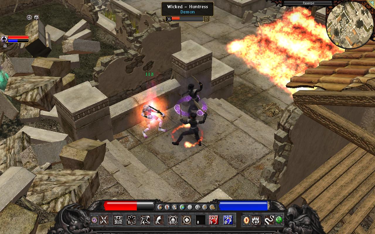
The issue I have in general. Really… I can understand if the average Joe still uses a low resolution like 1024x7something. But we’re gamers. Even on mediocre machines we are expected to play at least on a 1920x1080 with a fair amount of people even at 25xx resolutions. So I don’t get why the menu’s and graphics can’t be made smaller. We’re not 65 year olds with bad eye sight. The menu’s and health/mana bubbles don’t have to fill the entire width of the screen. WoW with its mods made that clear to me. I actually loved spending weeks on getting my UI the way I wanted. That’s how I learned that re-sizing most objects to half its size does most of the trick.
In that sense GD’s UI is pretty clean and minimalistic. And I like that.
I personally like the interface. It seems like some users complained about the gold color, but I think it gives it some snazz! Besides, since iron is supposed to be a valuable resource in this game, the gold interface makes the player character seem somehow special or otherwise not restricted by the mundane laws of the average citizen of the world. Maybe I’m looking into it too much, but the gold seems like a good representation of the player character (and it doesn’t seem gaudy either, in my opinion).

Above. Perfect Health and Mana “bars”. According to Bear Grylls and my own knowledge you have natural primordial ability to catch a sudden change in your field of view only by edge of your eye.
When lions, or wolves are stalking from your side, you don’t have to look directly at them. So if you have Diablo’s globes, you can enjoy playing a game, being in the center of action and still being able to notice changes in health and mana globes.
Shortly, there should be:
1.Big, eye-catchy H/M globes, “containers” etc
2.At the bottom corners of the screen/main menu
Please don’t try to reinvent a wheel. This is the only way(Diablo way, or PoE way) of making UI, not awkward “bars”. Globes are in harmony with nature and physiology of a human being;)
I have said:p
I am sure that you (Crate) could do that better, or just ask for our ideas:D Maybe some contest, brainstorm, etc. UI in my opinion is important as hell. That part of game should shine.
I too am more of a fan of the diablo ones. I really like how the globes are usually implemented into the ui.
I’ve design my own GUI for grim dawn. Nobody has to like it really, this was made under 20 mins roughly!
There is still work needed to be done with the concept and such, but i think this really gives a feel to the game.
Just maybe Crate will use similar style and improve were it needs to though.
Hope you enjoy!
Ace
https://www.dropbox.com/s/voeq0je7qlrzbej/Grim%20Dawn%20UI.png
Hi guys, I just wanted to let you know that I think the new layout and coloring is excellent! It has a nice contrast to the game background, so it certainly stands out. Also, I rather like that the health and energy is prominently displayed (it’s similar to the Big Bars mod for TQ) and that the map is on the bottom. Having everything in one place means less moving my eyes and concentration off the action!
My only complaint is regarding the artistic 3D effect on the health, energy and menu buttons. I think it rather detracts from the readability of those respective items. The health and energy bars really are affected by this as you should be able to readily tell where your health and energy are at through your peripheral vision. Having the extra white and dark areas to create a glass tube-like effect is distracting and I feel it will hinder the necessary quick reactive responses to low health/getting beat on/etc. that we will experience.
Other than that, I think it’s a step forward compared to the previous skin and layout.
Keep up the great work guys!
I agree with those who claim a darker less shiny UI, every single arpg fan I know want a creepy gore dark environnement and if this can be apply to the UI, This would be so enjoyable in longterm. 
Oh I am so a fan too, it’s classical but still, this offer the best ressource management and integrity to the genre for me.
Every modable rpg have a diablo ui lol
To name a few:
Wow
HoN
TL2
PoE
TQ (no globe though)
Update is today?
How much time for it?
10/10 HUD rating!
[Edit] I would remove the GD from the center and place a gemstone there. Botton used to toggle chat? Or to turn map on/off.
Isn’t it to exposed to a miss click, I mean it’s big, on the edge and on the center toward the action. Shouldn’t be clickable.

Yeah i was thinking the same, i’d remove the “GD” for something else, and make the metal darker. I really like what you’ve done here =)
I didn’t read the whole thread, so maybe it has been mentioned before, but I don’t like it if the HUD covers too much of the screen, in many game like in TQ it was more dangerous going south than north since you couldn’t see that far ahead because of the HUD.
This is an old Grim Misadventure.
Check this latest one out: http://www.grimdawn.com/forums/showthread.php?t=6471
Their will also be camera options to rotate the camera, or zoom out further. So although I understand where you are coming from, I think GD will be fine. This is also pre alpha so things will be subject to change as time goes on.
Im currently playing TQ n totally love it! Will definitely buy this game at its launch!! Meanwhile I have a lil suggestion on this HUD, perhaps u should consider moving the skill slots and the 4 icons on bottom left away from each other, they look jumbled up.
Cant wait to play the game.