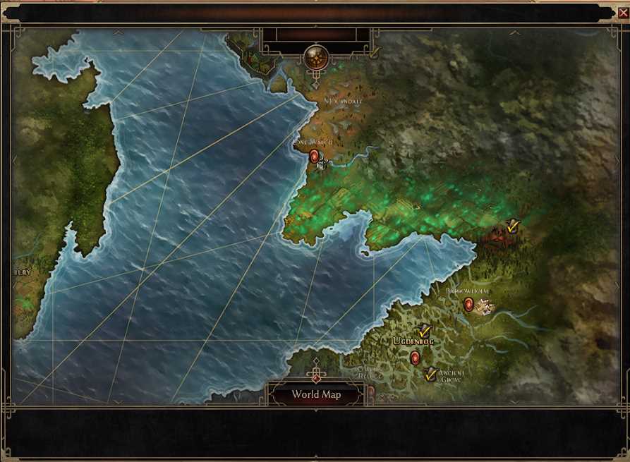
location names like barrowholm, mourndale, lone watch lost font borders so (compression notwithstanding) they became barely legible in-game.
1.3 playtest:
1.2.1.6:
location names like barrowholm, mourndale, lone watch lost font borders so (compression notwithstanding) they became barely legible in-game.
1.3 playtest:
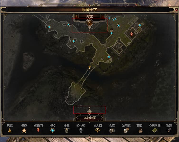
side note, are those protrusions really supposed to be there? why take up map real-estate with those vs them having them in the bars or OG smaller arrows ![]()
example
also more spikes, 1.3 shall henceforth be named the bejewelled spikes’ patch ![]()
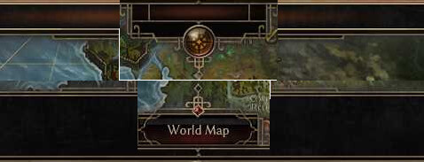
Apart from the weird spike, I really wish the world map button stayed on the bottom there. I click on random rift gates every time I try to press world map.
This happens to me all the time. There are several locations in the game where the worldmap button overlaps with a riftgate. I already reported it as a bug, there was a similar bug once where the lowest NPC dialogue option overlapped with the evade button, that was fun lol. But they fixed it, so hopefully they can fix this as well.
I don’t mind the current layout with the spikes and everything, I only think it could look a little bit more grim.
The world map should be displayed on the entire screen, not in a window, as it is now. I constantly have to move the mouse cursor to find the portal I want. This is not very convenient. With the release of FoA, the world map will become even larger.
I don’t have a problem to navigate the world. Even if they provide you with a “entire screen” you still need to navigate to locations, and let’s be honest, it only takes a few seconds.
Go look at Sacred 1 and 2 for example, they did provide you with a “entire screen” but you still need to move around to your locations.
Maybe if they slightly increase the portal icon size it will help you and others ![]()