Please optimize the position of message box of regents transfer

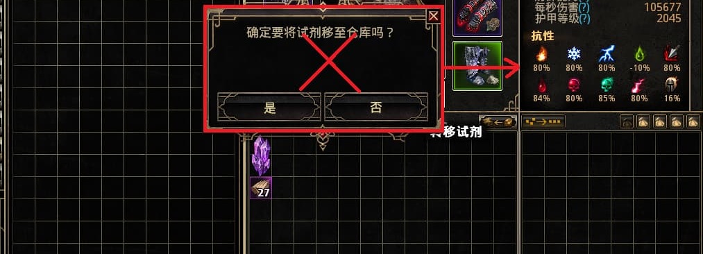
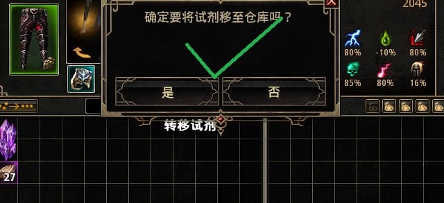
When opening the store, this message box of regents transfer oddly shifts to the left (Figure 1), which increases the distance between it and the cursor. It’s not a huge problem, but it does make the mouse a bit less convenient to click. Please fix the message box so that it stays in the correct position (Figure 2).
2

This feedback is given with the understanding that you do wish to see the confirmation message each time?

the way i’m reading it is the complaint is the box is offset and not centered to char screen

(tho my guess is it’s because the stash moves where the centre is when stash is open? :thinking: )

1 Like

Yeah. They centered that box position. That makes offset with the cursor.