Hi everyone!
First of all, I would like to start by saying that I have immense respect for the Crate Etertainment team; I think their communication and responsiveness to player feedback are exemplary, and should be a measuring standard for the gaming industry as a whole. Secondly, their passion and dedication to this game are also extraordinary, and I am amazed by the amount of free content they seem to be pushing out constantly. It really puts asctions by some other developers into perspective.
With that said, I would like to offer some constructive criticism, or maybe some suggestions.
Like many, I was very plesantly surprised several months ago when Crate started making visual changes to the game, specifically, when they introduced changed visual effects for item skill modifiers which convert damage from one type to another. This is really a remarkable step, one that enhances immersion in the game significantly. Since then, there were a number of visual changes to the skills in the game. Some of them are fantastic, in my opinion - Maiven Sphere for example, and Blackwater Cocktail. I also think that the new Blade Spirits and Ring of Steel are great.
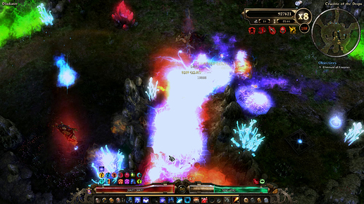
In this last patch, a number of changes were also made. The new Sigil is really beatiful, very spooky and very fitting for an Occultist. However, there are some changes which I find somewhat unsuccesful. What I have in mind are Thermite Mines and Trozan Sky Shard. Thermite Mines are much bigger now, it seems, which is not that big a problem. But they seem to be spewing these little fiery fragments, which honestly looks somewhat worse than the pure flame jet before. I do like the new flame jet part, thought, but these fiery fragments at their base are too dense (even with partilces set to low) and when an enemy is on the mine, these fragments often obscur the view of the target.
Trozan’s SkyShard is even stranger. I have to be frank, and say that the new appearance is much, much worse than the old one (to me, that is). Before we had a comet, an now we have shards of ice. While the new visuals might fit the name of the spell better (although the skill icon still reminds me of the old effect), these shards are somehow overly rough on the edges, very rectangular (sorry if this is not the right word, English is my second laguage) and overall it looks like a downgrade in visual quality, compared to the previous look. Let me use this comparison - this new effect reminds me of situations when you have to downgrade the image quality of the game because your computer is not powerful enough to run it smoothly. I think that’s a shame, especially when the previous animation was so beautiful.
I am sorry if my post sounds overly aggresive or negative, but I am really curious to see what other members of the community think about this.
