This is probably the only major gripe I have with the new UI. The spike in the middle seems out of place and distracting because it isn’t level with the top of the two orbs which gives it a prominence that I suspect wasn’t intended.
I thought I was going to hate the new UI, but all in all I quite like it.
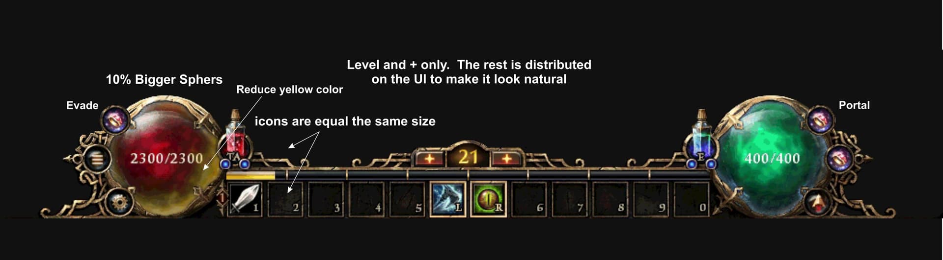
I think it’s good that the Evade indicator is the only thing in the center.
But I really don’t understand the height of the central “ornament” and the spike on top.
Showing as much of actual gameplay as possible is a good rule of UI design for a reason.
Personally, I don’t particularly need a prominent arrow pointing out my character’s location.
Another thing I started to note is how much the gilded socket of the orbs actually distracts from the functionality.
I’d rather prefer very slim borders, so I can easily see changes in my HP total.
The first image in this post is a pretty good example, where the orbs are very readable.
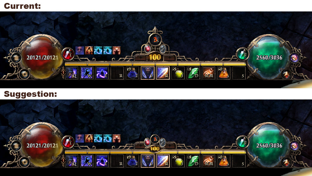
Overall, this is definitely an improvement over the previous iteration. The center doesn’t stand out nearly as much and it is a bit easier to see the orbs in my peripheral vision. The center spike is still just a tad taller then the orbs, however. I’d say now instead of the prominence being in the center, it’s split between the center and the orbs 50/50. So, neither are truly prominent. I still think the orbs need just an ever so slight increase in size but nowhere near as much as they needed with the previous center layout.
Yeah, I can see this point as well. They do intrude on the functionality of the orbs just enough to be a hindrance. I think it’d look better without them.
This is certainly a step in the right direction. They’re almost perfect. They did tone down the glare on the top left portion of the orbs like Rekt brought up which is nice. I do wish they’d have increased the sizes of the buff/debuff icons to match the original hud as well but they have limited space in that area so decreasing the icon size does make sense so we don’t have “rows” with 2-3 buffs in it.
This was one suggestion i made too. It looks much cleaner
We play the game for many hours, so the evade is a second language to us, so really not needed in my opinion to be centered. Look at Titan Quest 2, Wolcen and Last Epoch for example, evade skills are also not in the center, so again i don’t see the need for it to be in the center herein too.
Edit:
What also might work if they just make the evade a buff icon, so when you start the game the evade shows as a buff icon. This way, there is no need to place it in the center looking like the Eiffel Tower xd
I think removing the central arrow to make the dodge ‘orb’ consistent with the health and energy orbs is probably the way to go. Regarding the health and energy orb sockets, I think reducing the widths of the bars underneath the arrow shaped bits might help with this.
I’ve also noticed that the proportion of the orb that is full doesn’t quite seem to match up with how much health the character has. I’ve got a hardcore character with ~17k hp that I play regularly and I panicked when the health orb looked half empty, despite the fact it actually had ~14k hp left when I looked again. I’m not sure if this was down to me not being used to the new UI yet or whether there is a mismatch between the fullness of the orb and the character’s health because I’ve not looked into it further yet.