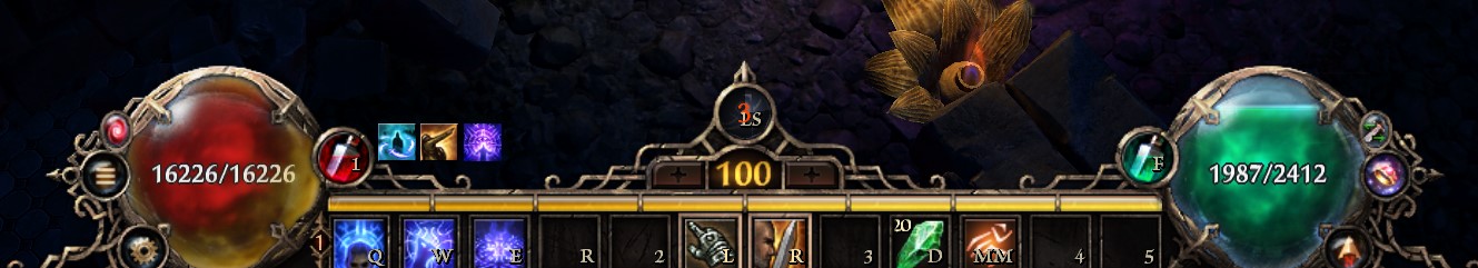
So this is what it looks like now.
I think it’s good that the Evade indicator is the only thing in the center.
But I really don’t understand the height of the central “ornament” and the spike on top.
Showing as much of actual gameplay as possible is a good rule of UI design for a reason.
Personally, I don’t particularly need a prominent arrow pointing out my character’s location.
Another thing I started to note is how much the gilded socket of the orbs actually distracts from the functionality.
I’d rather prefer very slim borders, so I can easily see changes in my HP total.
The first image in this post is a pretty good example, where the orbs are very readable.