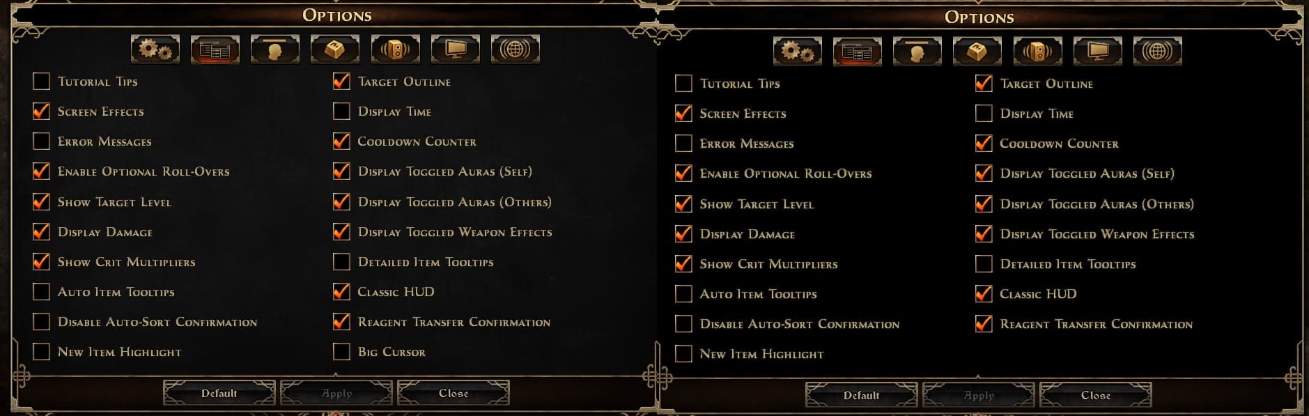
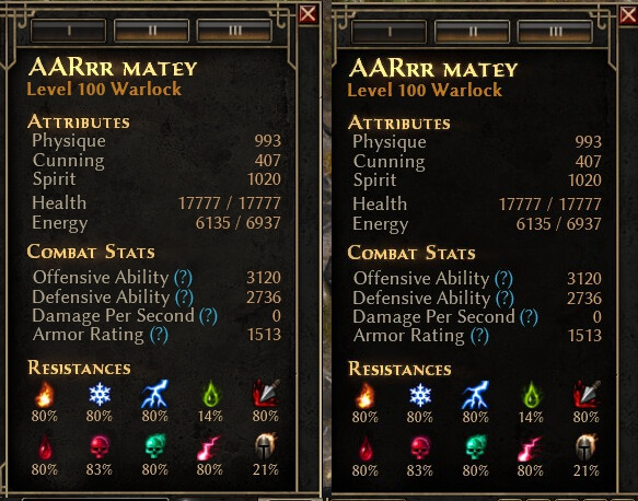
thought i was losing my mind after updating/thinking my vision was getting blurry, so took some 0.3 screenshots side-by-side with 0.6 or 0.7 i think it was
*i like the new textured background or whatever we call it,
but since the old text colour/saturation was made with the former darkmode in mind, seems like it’s less crisp/fades more into it
Ngl, I can hardly see a difference between the two besides the red ‘aura’ behind the name being slightly brighter on the left and text overall being slightly brighter on the right. Can you highlight some specific examples of what you’re talking about? Do you mean the text is less clear as in it’s blurry or less opaque?
i’m saying the newbackground is better,
but having old light contrast with new light background obviously results in less contrast on the same text, “light on light”