What?
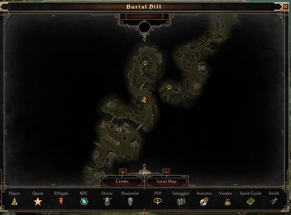
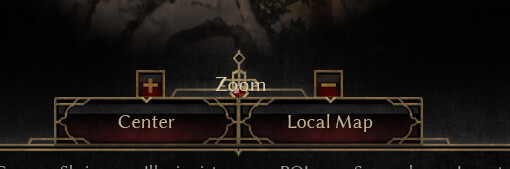
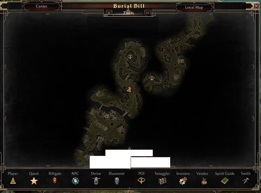
Just what is going on here? Now we have 2 buttons invading the middle of the map rather than just one. Now the muscle memory of opening the map and pressing the center is gone. The + and - icons are so weirdly placed and Zoom text is overlapping the weird decorations.
Yet that’s not even the worst of it, look at the top. The empty circle. All those shapes at the top doing nothing at all. Just an empty label box with an empty bottom margin with an empty icon slot in the middle? What is happening here?
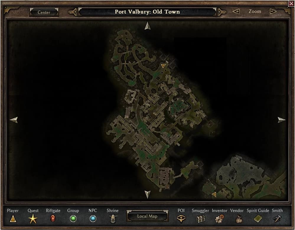
World map is even worse. Empty top bar looking like there should be a title or something there. The empty label with an empty bottom decoration with the empty circle and the arrows just taking space, still doing nothing. Now accompanied by an empty bottom bar with 2 really awkwardly placed buttons that should probably go inside that empty bottom bar instead of whatever is going on here.
EDIT: Since this was moved to bug report I will add that the overlap is on a 2560x1600 screen with UI scale slider at the middle position
You are playing the test patch, it’s obviously a work in progress.
After playing the game for 7k+ hours, it took me less than one minute to adjust to the slightly different location of the button. It’s not a big deal.
That being said, yes, imo the map did get a little bit worse. I still prefer the old layout with the center/zoom buttons next to the location name and the map toggle button on the icon bar:
But again, not a big deal. In a few months no one will talk about it anymore, except maybe some hardcore oldschool traditionalists, but I guess those are still playing 1.1.9.8 anyway.
I don’t think this is going to be an issue at all (except the placement of the zoom text and buttons) I don’t think it’s a big deal either.
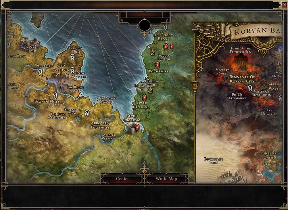
I just don’t understand the purpose of it. A visual flair that looks good is something like the Korvan Basin. There’s a lot of visual flair there. And it looks good. This one it looks like UI elements, left empty. Not visual flair. That’s why I’m wondering about it.
I am not sure if “Center” is really needed, all it does from testing is focusing where is your character on the map. That being said, I don’t care much if the button stays or not
Since it seems to be a work in progress all I gotta say is the “zoom” text is on the way
Maybe the UI designer got bored and/or wanted to try out a few different things but wasn’t able to finish it before the test patch got released today.
People have been complaining about those spiky elements protruding into the map before, and what we are seeing now is probably just an intermediate step. I guess one of the next patches will have the element at the top removed and the zoom buttons in their correct place.
Game development is a bumpy ride, sometimes weird half-done things like these are to be expected.
or, hear me out, they could also just be placed back in the “border” bar like it was before /as you could see by several other posts it wasn’t just about the spike/decorative element, but the whole thing/both buttons being “popped in” to the map itself instead of stay in the bars/frame