Preferred the passive stance rather than the aggressive stance - could that be a menu toggle?
Don’t really like have the options and exit so small in the bottom left
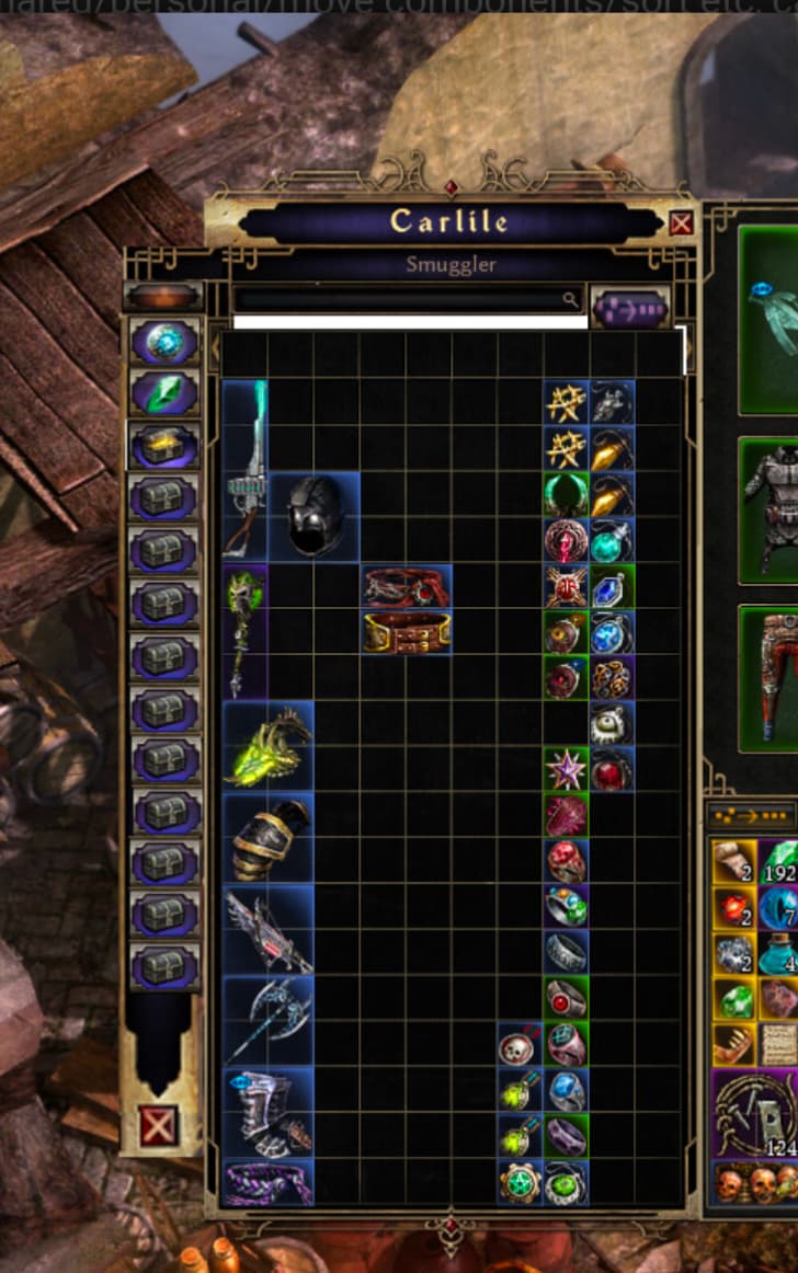
Stash
Don’t really like the smaller “Item Stash” <> “Item Transfer” toggle
Don’t like that you have to scroll left and right to get between all the stashes in the transfer view, could the reagents buttons be on their own row underneath (or above) the stashes?
General UI
Don’t like the big north indicator. Make it an option toggle in settings?
Don’t like the new HUD, but even for people that like having the ball-style, having the “L” and “R” in the middle splitting up the 1-5 and 6+ key bindings is odd. Why not just have the numbers first and the “L” and “R” at the end?
I agree the exit button could definitely do with being larger. Equally, the entire bottom row of buttons on the left hand side of the main menu would probably benefit from being the same width as the others.
If this model with side tabs gains traction, in addition to greatly optimizing item searching by eliminating the scroll arrow, it would also allow for at least 2 to 3 more tabs than were announced in the patch, bringing the total to 14-15+.
This is the only part I disagree with personally, I like the new hud and the L+R mouse buttons being in the center is different but not bad. I like that both huds have differences that draw a player to one or the other.
I am digging this side panel stash tab button idea though. looking at the stash ui in the game, there’s plenty of space to use there on the side where you don’t need the scroll buttons for the different tabs. I hope they consider it
The real issue is the storage, I agree we need at least 15 or so tabs. I can’t tell you how horrible it is trying to cycle through characters logging in each one I have like 10 different characters with epic/leg gear in different areas it just a pain. It is hands down the worst thing about making a new character. I spend 1-2 hours trying to find what I have. In other ARPG’s I have so much space on 1 character I just put everything in there and I am golden. I might have a dump character but logging in, walking to storage, teleporting, and my wife plays with me so we both have to do it. Just the only real problem I have ever had with Grim Dawn. All other ARPG’s solved this issue. I think everything they are doing is amazing, but please, whatever we can do for more stash tabs make it happen!!!
Some of this changes man, are mind boggling to be fair lol. I personally think whatever their internal release date are, should be pushed out maybe towards December and ensure everything is well cooked before putting Grim Dawn down and working on Grim Dawn 2
Let’s be realistic herein, Grim Dawn will always be playable but will be a dead game with no more content coming in future, due to the limitation of the older engine.
And, of course Grim Dawn 2 is on their list. So it makes sense, take your time now, ensure everything is right while having this opportunity.
I still also think the Skill UI aktivated skills like Raked sayed are a little bit to wide and cover a little bit to much of the aktive selected skills aka the yellow outline.
Splitting the bar in the middle feels really bad. I was hoping I get used to it, but it’s frustrating. Having a quick glance at the bar worked well to remind me where I assigned the skills (mainly during the leveling phase where nothing is set in stone), but split bar makes this hard to quickly guess and I have to actually check the numbers instead.
Especially since the buttons look almost the same as the rest of the bar, and they could easily be moved to left and right side of the bar, or just both in one place as before, where they would make more sense.
I think it works well to have the L/R in the middle, though it’s unusual. It means that if you have a cooldown skill on right click, you can see all your important cooldowns (main skills and potions) in the same small area of the screen.