Yeah back to that one we go.
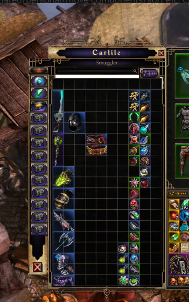
I posted this elsewhere as a suggestion instead. (Just used paint to cut/paste and move the blocks around)
Also potentially leaves room for one more row of stash space per tab and a bigger search bar.
Yeah back to that one we go.
I posted this elsewhere as a suggestion instead. (Just used paint to cut/paste and move the blocks around)
Also potentially leaves room for one more row of stash space per tab and a bigger search bar.