This blur is very distracting and makes the text very hard to read quickly. The contrast on the colors is perfectly fine for me with the Black/Charcoal/Brown/Gold here. It’s readable and looks good overall (except the background highlight).
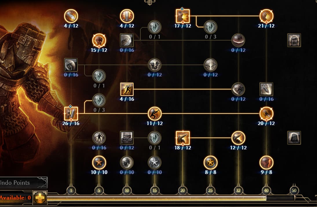
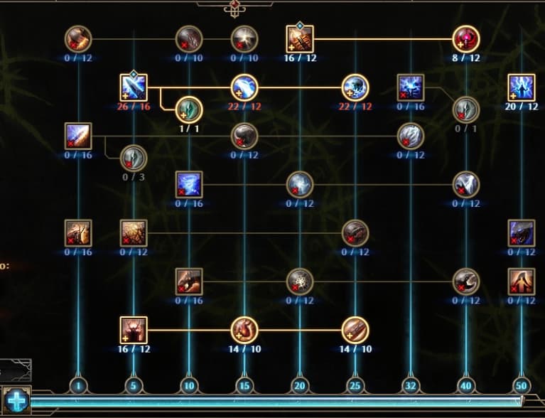
This I’m okay with and have adjusted to. I get what they are trying to do here and it works once you understand what the gems and the stronger lines/hash marks mean. What I don’t like is the “glass” overlay for the skill icons that appears like a hazy reflection on the top left portion of each square. The circle secondary skills and passives have a globe reflection on them that is distracting as well. You can see the “glass” reflection I’m talking about on PB and VoS more easily vs the Soldier skills in the post above.
If the blue highlight wasn’t present to denote +skills and instead the numbers themselves were a blue bold font I would be okay with that. The blue highlight behind the current numbers is pretty rough and blurs the text again…
I also agree about the excessive brightness; at many times it makes quick viewing difficult and dazzles my vision. Those various lines also bother me; they start to intersect, turning into a checkered field full of lights.
To add to this. There are too many decorative lines around every window.
It’s giving the vibes of some alternative reality steampunk-french palace or something, but not a grim dawn world.
Especially considering the new area where we’re fighting against and with axe-wielding barbarians, it seems to going slightly less modern, which contradicts the UI changes even more than this neon-steampunk layout.
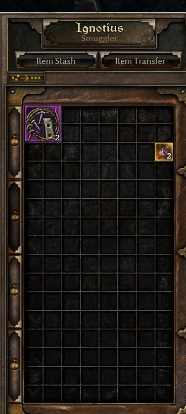
And I can say it enough. Vertical stash tabs on the side of the stash screen instead of this terrible scrolling.
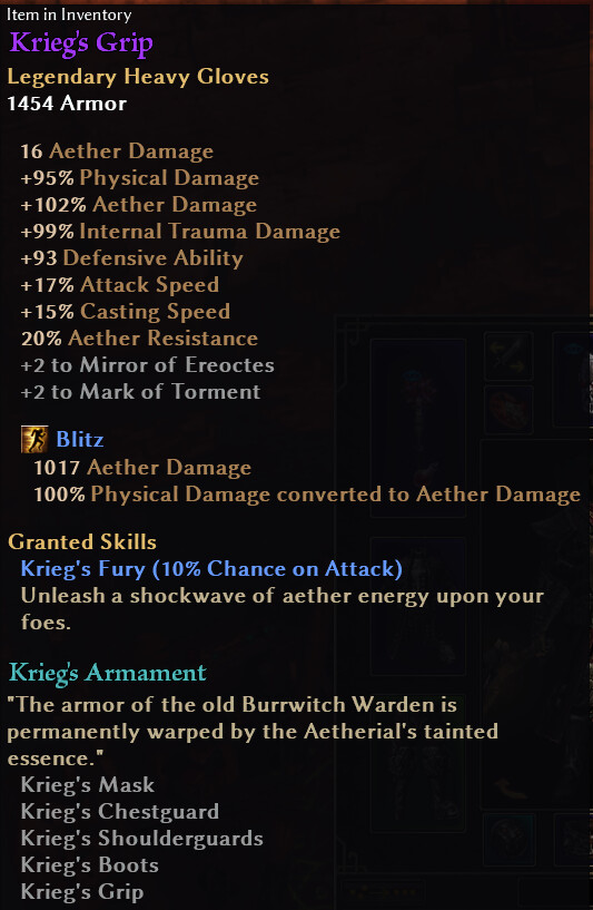
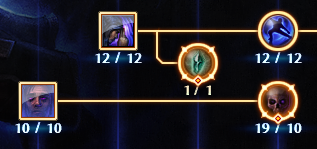
Regarding the skill window, something I have noticed is that when you have only “real” points in a skill, the “x/y” numbers are pale yellow. When you have a +skill boost they turn white.
This is counter-intuitive to me. White is more vanilla and less eye-catching than yellow. It doesn’t say “I am being boosted by an item bonus” to me.
Obviously, not exactly a critical issue, but it is quite helpful to be able to see at a glance which skills are getting boosted by items and which aren’t.
Or if zantai want to keep the current view, than when clicking on the arrow (left or right in the stash) it should show the next “row” of the next stash tab instead of showing only the next one only
That’d be better but it’s still unnecessary added clicks which don’t make the stash UI more clear compared to having them all in sight at once.
I see no benefit to keeping as it other then “were sticking to it and shifting it is too much work now”
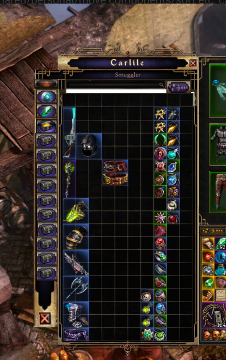
Wow… great idea! The side tabs are much better, really great. I’d say that with this side design, even more additional space would fit without being a problem. I hope they pay attention to this issue, and maybe add a couple more tabs, haha!