I think you are right about this. After playing with it in-game, the scrolling toolbar is annoying.
I think it would also be nicer if the components and materials tabs’ buttons are always visible instead of only being available when switched to shared stash.
5 Likes
+1 from me, really like such design
Well, Grim Dawn was never meant to be shinning… Make it rustic, worn and darkish to fit the game’s world really…
2 Likes
When we started with the UI overhaul, we had some initial reservations about this approach as it does cut into the horizontal space on the screen in a way that was problematic for lower resolutions.
But as UI does automatically rescale with resolution now…well… try it out in the next build.
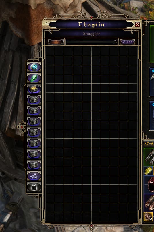
This change has also allowed us to add another row to the stash on every page, so everybody gets another 5% storage to boot.
30 Likes
Thanks Man
That’s wonderful, that’s great!!!
I have a question: currently in the 1.3 test version we have a total of 8 tabs, this image shows 10 tabs plus 2 more for purchase totaling 12. Will this increase be included in the patch or will it only come with the DLC?
An additional 2 personal and transfer tabs will be included in FoA.
6 Likes
There’s room for about 3 more tabs, making a total of 15, what do you think?? kkkkkkkkkkkkkkk =)
1 Like
Lovely!
Adding more characters because lovely alone isn’t accepted.
1 Like
That looks awesome, and the extra row of space per tab is huge
Thank you for suggesting this and creating the mockup image that got the ball rolling ![]()
2 Likes
Being able to see all the tabs without scrolling will be good.
I agree, the skill tree has become too difficult to read and intuitively navigate than before. It might be a brightness issue; perhaps smoother transitions would be better.
3 Likes
The new build didn’t change the shinning / glare of the new UI, hopefully something is baking (plz ![]() )
)
5 Likes
I’m hoping too man ![]()
Also, if they change the “bronze” theme to rather-rustic metal based on the new UI will also look good i’d say.
2 Likes
I agree, if they wanted to make it clear maybe make the line that you’re currently on shine up but the rest need to be muted/blended in I don’t need to see what my level 1 mastery point lines up with anymore
2 Likes
so far for me the new ui is too garish and less immediately readable (though that might be a matter of familiarity). i’m more fond of the previous more rugged look.
6 Likes
that was nice change. a lot of the times i’m using the stash i’m putting some stuff in personal, some stuff in shared, pulling some stuff from shared to keep in personal cycling through tabs to pull from or put into and so on. so i tend to switch back and forth and immediately switch tabs. the button to switch between personal and shared still being on top kinda messes with that.
Pull out the red skill points and use them somewhere else will help a bit, it’s free skill points and you don’t have to stare at this bright red
1 Like