What do you think?

Hello

I’ve been trying to see where we can improve the UI, what do you guys think?

It looks much cleaner

We play the game for many hours, so the evade is a second language to us, so really not needed in my opinion to be centered. Look at Titan Quest 2, Wolcen and Last Epoch for example, evade skills are also not in the center, so again i don’t see the need for it to be in the center herein too.

Edit:

What also might work if they just make the evade a buff icon, so when you start the game the evade shows as a buff icon. This way, there is no need to place it in the center looking like the Eiffel Tower xd

The perfect UI doesn’t exis–

9 Likes

Well for starters the energy pot is the wrong colour.

the mugshot is missing
image

2 Likes

Is this screenshot from GD?

That’s from a pre-Alpha video from 2013 and is what the really old UI looked like.

2 Likes

I took the screenshot from this video https://www.youtube.com/watch?v=XYI2DMPWpWg

This is imo the best looking HUD stylistically, it really fits the game’s theme. Ofc the current layout is much better with the energy bar on the right instead of under the health bar, but the look and feel of that old HUD just nails it. The animated mugshot of the player character is the cherry on top. I would place it right in the middle though, Doomguy style :wink:

3 Likes

That is not entirely correct. The screenshot is from Zantai himself, the pot in the screenshot is modified (Fangs of Asterkarn feature) so it changed color.

The current UI layout with this theme or maybe rustic and/or worn will be good too. I prefer the new layout over the older layout though.

Correct yes, i actually took the UI from the misadventure post and edit it with suggestion for improvements.

I prefer the original. The Evade cooldown counter needs to be in a prominent, central position. Also, I think that toning down the decoration has made it bland and nondescript.

1 Like

I don’t use the evade skill even if it’s currently in game as a feature.

I thought you were proposing this as a possible UI for players in general. If it’s just for you then only you can say if it’s good.

1 Like

I see. Thanks for the correction.

2 Likes

The propose UI is for general yes. I feel the center in the current UI is way to big. I’ve also moved the evade to the left side, this is not by any means perfect, but to give an idea to build upon, maybe?

Evade needs to be in a prominent place. If you want to get rid of something from the middle you could move the level counter.

However, I think the original looks better anyway.

1 Like

Let’s see in the comings weeks what happens man, it needs more cooking

Before I type my take on this I think it’s really important to realize a few things. Bear in mind this is totally subjective based upon what I see and doesn’t make me 100% right.

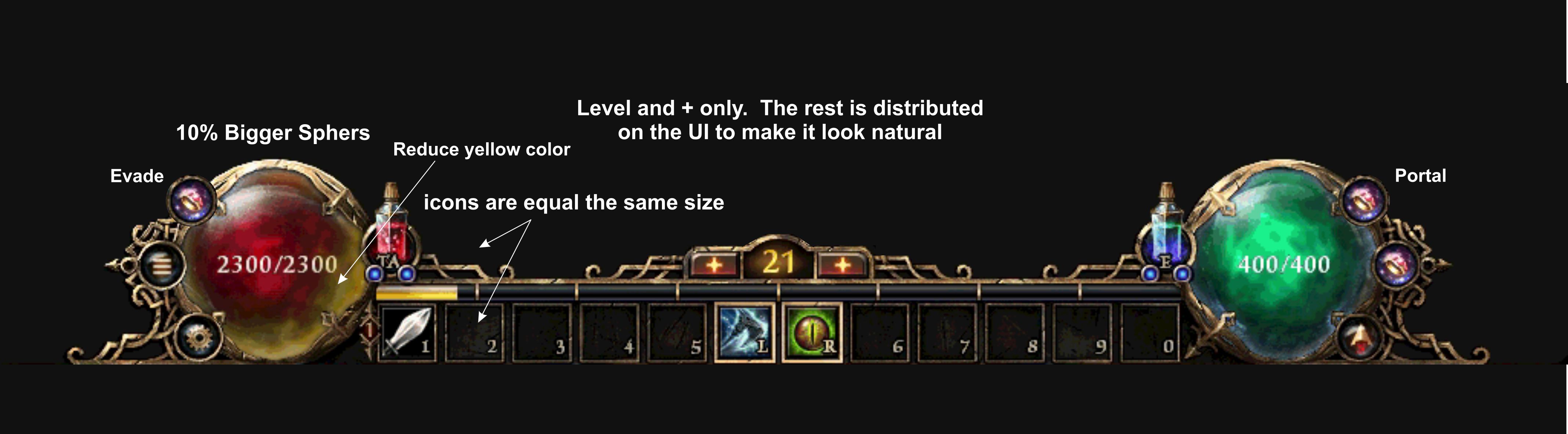
Let’s start with the screen shot in the first post.

The evade button:

Seems to be placed here and sized in a way that shows bias. I use the evade a lot. HC old SR 80+ = life saving. My point: not everyone refuses to use a feature. The CD for it needs to be seen for those that do. Just like the cooldown for skills, which I will get to in a bit.

Bigger orbs: +1, nuff said

Less yellow constitution on orb: indifferent. I been playing the PTR hard this go around (for me anyways) and I barely notice. What I do notice I’ll place below but it’s a subjective issue.

Skill icon/buff placement/size: I’ll go out on a limb here and say people want them the same size for visibility? Fair enough. But want to shrink the evade because “I don’t use it?” Would people be okay with all the skill size shrinking to match the current buff icon size? My bet is the community would freak.

Now my issue with the current buff icons isn’t the size but the space between the buff icons and the UI as a whole. My dumb brain keeps thinking I am still playing with health bars. So when that space is filled with any sort of dark background, my brain thinks my health is at least half gone. Big ask but if I was to ask I would just have the buff icons sit right on top of the UI with no space. Having said all that, skill cooldowns need to be seen, buff times should be seen…this includes evasion.

Portal button: seems fine

So potions: opted for basically a large spike by each orb instead of the one in the middle. Granted you can make the argument that the center spike serves no purpose. One way or another doesn’t matter to me.

I would ask for the potion size to shrink and the orb it’s in to get bigger but not above the orb UI.

The most important thing is to look at the community as a whole. I am not the only player - I say to myself. But if the UI was to go live today, the most needed change, for the community as a whole, is the orb size.

If it’s still not to people’s liking when live, they have options to go back to the original.

1 Like

I would be happy for bigger orbs and if the center is re-designed because it looks strange lol

And then E1m9 midi kicks in :boom:

1 Like