FarthestFrontierPlanner.zip (2.1 MB)
Zip file contains HTML file. open in browser and test.
Would love the feedback. Also have it up on github pages. Farthest Frontier City Planner v1.0
UPDATE ZIP file and github page updated with latest build(building costs still all over the place)
RE-UPDATE ZIP updated, latest build pushed to github page. 4/11 5:25pm CST
Farthest Frontier City Planner — Update Notes (2026-04-11)
New Features
- Terrain Painting — Paint water (
 ) and forest (
 ) tiles on the grid. Buildings cannot be placed on water (bridges only). Click & drag to paint, right-click to erase.
 - Background Toggle — Switch between parchment and clean white background for better visibility.
- Click-Drag-Click Road Placement — Click to place anchor, move to extend in any of 8 directions (auto-snaps), click again to place. Matches in-game feel.
- Diagonal Placement — Roads, fences, and walls can extend diagonally in staircase patterns (

 ).
). - Villager Capacity Counter — Status bar shows max population at each housing tier (Shelter/Homestead/Large House/Manor: 4/5/6/8 per shelter).
- Fruit Tree Counter — Separate counter for placed fruit trees.
- Well Overlap Warning — Green
 on wells whose 2×2 footprint falls inside another well’s radius (refill penalty).
 - Fishing Shack & Work Camp Work Areas — New detachable work area markers added under their parent buildings.
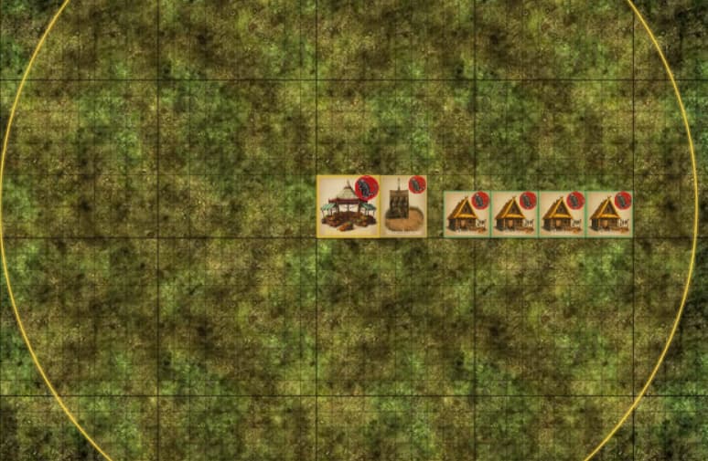
New Buildings & Icons
- Watch Tower (Lookout Tower upgrade) with stone tower icon
- Fort (Barracks upgrade) with castle icon
- Lookout Tower now uses correct wooden stilts icon
- Barracks updated with higher-res icon
UI Improvements
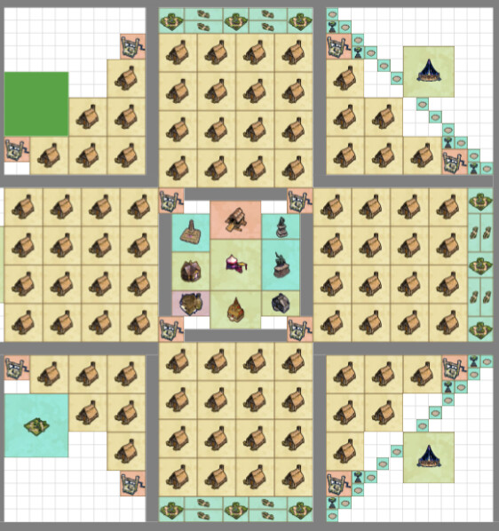
- Parchment Background — Clean, matte procedural parchment replaces grass texture
- Solid Building Icons — Full opacity with bold black borders for visibility
- Gold Building Labels — Bold gold text with black outline, auto word-wrap for long names
- Font Size Increase — All UI text bumped +1pt for readability
- Brighter Red Buttons — Clear and Erase buttons more visible with bolder styling
- Larger Trash Icon — 50% bigger on Clear button
- Place/Erase Toggle — Merged into single button that switches between modes
- Rotate Button Removed — Tab key handles all rotation (shown in status bar legend)
- Categories Collapsed — Sidebar categories start collapsed for cleaner initial view
- Right Panel Bar — Visual frame on right side of grid
- Centered Grid Start — Grid starts centered so users aren’t boxed into NW corner
- Status Bar Reorganized — Counters on left, Zoom/Cursor on far right
Fixes & Corrections
- 20+ Building Tiers Corrected from in-game video evidence
- 45+ Building Costs Updated from v1.0 game tooltips
- Rotation Order — Now cycles → ↓ (horizontal, diagonal, vertical, diagonal)
- Market Radius corrected to 13 tiles (Market Square: 15)
- Desirability Radii Hidden — Only functional radii shown (Market, Well, Work Areas, Barracks, Lookout Tower, Apiary)
- Sub-building Badges — Only Fruit Tree shows “PLANT”, all upgrades show “↑ UP”
- Custom Clear All Dialog — Themed confirmation with “This CANNOT be undone!”
- Procedural Textures — Unique textures for all road/wall/fence/bridge types and their gates