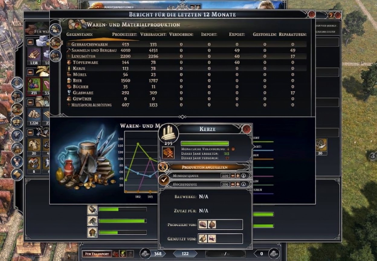
I’d like to suggest a small but impactful quality-of-life improvement for the statistics and resource tracking panels.
The Issue:
Currently, checking the statistics or production windows requires reading through text-only lists. Because the UI lacks visual anchors in these lists, finding a specific resource takes a bit longer than necessary during active management.
Proposed Improvement:
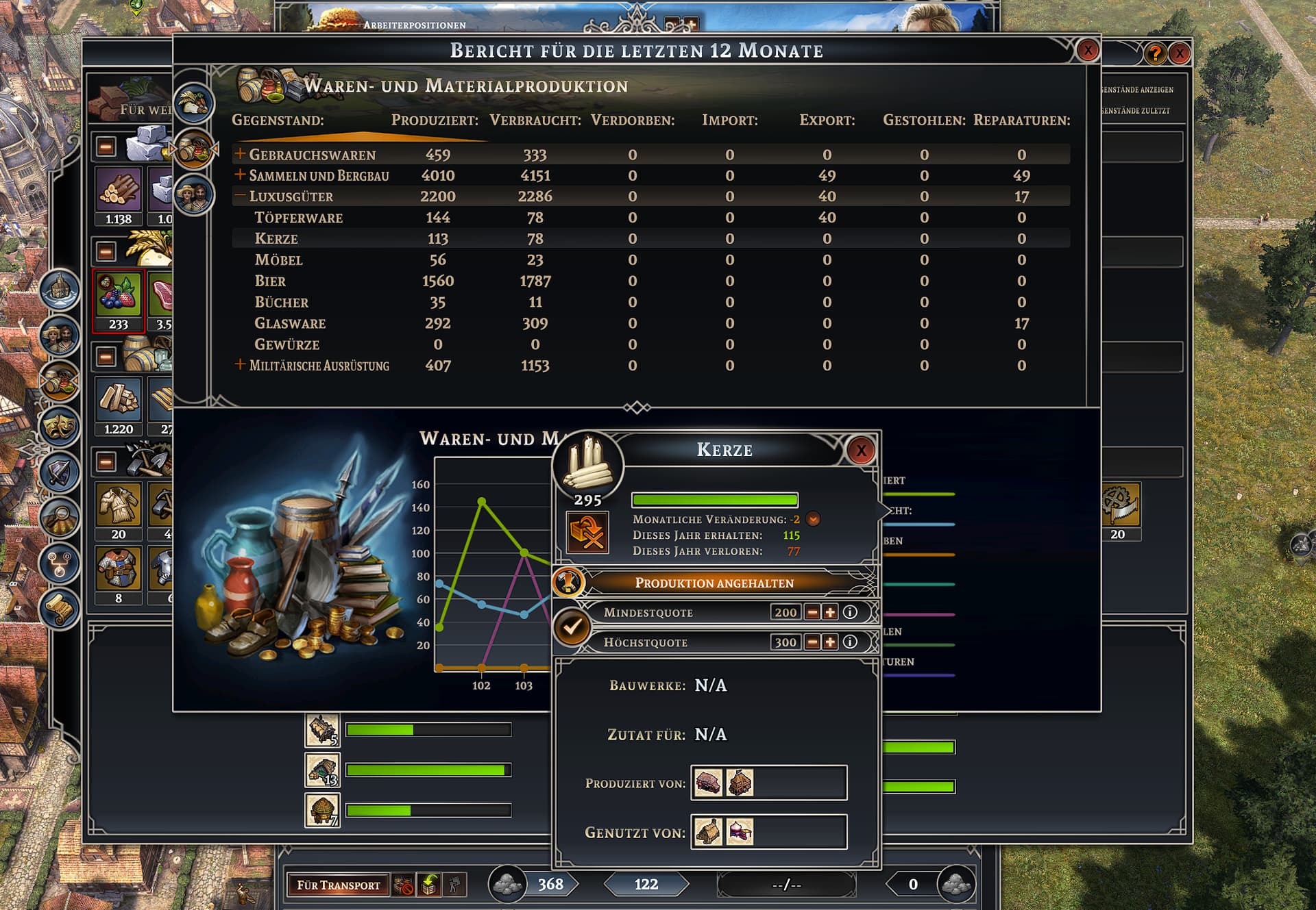
- Add small resource icons directly to the left of the text labels across the statistics, production limits, and inventory overview screens (matching the icons used in storage buildings and tooltips).
As visual proof, here is a quick mockup of how much cleaner and faster it is to parse the list at a glance with icons added: