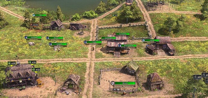
I really liked the minimalist design of the Unit UI toggles where the name bar only showed green/red if the villager was missing health and was otherwise a transparent black. It was a lot easier on the eyes, especially when you start getting hundreds of villagers.
Now, the villagers health bars are always full green all the time. Not only is this a lot harder on the eyes when you have a lot of villagers, but it makes it harder to see which villagers actually are missing health amongst the sea of bright green. (it also makes it harder to see profession icons)
I am unsure if this was an intentional change or not, but if it was intentional, I would like to request either reverting to the previous style of the name plates, or giving us an option to not show the green.
Thanks!!
