Dear Crate, thank you for an awesome update! The new difficulty for Veteran, fx changes, balance changes, the new renderer with performance gains, autolooting…those are fanatstic additions to an already great game!
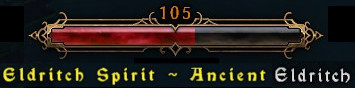
However, one thing I don’t like in the new patch is the size of the Monster HUD, specifically the font size. It’s too big. It takes too much space on the screen, and depending on the positioning of your character, it can block your view of enemies completely. I also think the gothic font is not a great choice, because it’s not as easily readable as the older, plain font. But the size of it is the main problem.
I would like to suggest that you consider changing it in some way, primarily reducing it in size, beacuse at the moment, it’s extremely distracting.
Thank you very much for your hard and excellent work!
another vote for decreasing the size of these fonts. they are comically big. I’m not even a fan of the new diablo font, but would at least settle for something smaller.
Exactly this. I don’t like the healthbars directly over monster’s head, so I definitely need this Monster HUD. But now it’s taking like a fifth of the screen (ok, maybe not that much), which is way too much.
Here’s a quick mock-up of what I think would look better and easier to read:
Monster name under the HP bar, font size same as race name.
Also monster descriptions like “Arcane” could be in a different color to make it more readable. I consider these descriptions more important than the name or race of the monster (especially Arcane, anyone who played high SR knows that I mean)
I want the old font back, this “ghotic” font is not meant to be read fast. I am a teacher and if I had this font in my powerpoints no one would be able to read them
Don’t think that is a matter of serifs. The shape of the letters in that font differs from standard ones to which most players accustomed to. Especially not english native speakers.