Exactly. These are elements of UI you don’t need to read in seconds to extract vital information. Monster UI is.
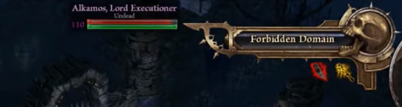
Also, that “Dangerous/Treacherous Domain” sign is way too big also.
Exactly. These are elements of UI you don’t need to read in seconds to extract vital information. Monster UI is.
Also, that “Dangerous/Treacherous Domain” sign is way too big also.
It got smaller, but still too big…
It was honestly NOTHING wrong with the monster HUD previously.
Sure boring and plain, but it worked - you get the relevant information quick and easy to read.
Now its just massive cluttering IMO
Honestly I don’t mind the font, it could do with some downsizing though, as well as the monster health bar
at least have some kind of background on the font, that should make it somewhat easier to read.
Crimson Roman is another easy-to-see font.
It is easy to change this display to another font, but the drawback is that the display position is slightly higher.
A sample for those who try.
nevisshadow-lg_spaced.zip (227.0 KB)
How to use: just copy to the following folder
Grim Dawn installed folder\settings\fonts
Wow!! That font is actually great! If they used something like that, and reduced its size, it would be perfect!
Yeah, that’s maybe even better, if the bar is on the very top of the screen, it somehow less disturbs your view of the scene
and you get the most relevant info- the name and stats of the monster more central to your vision
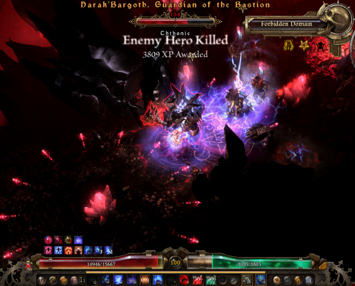
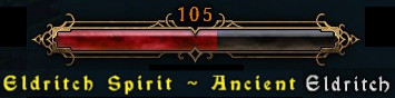
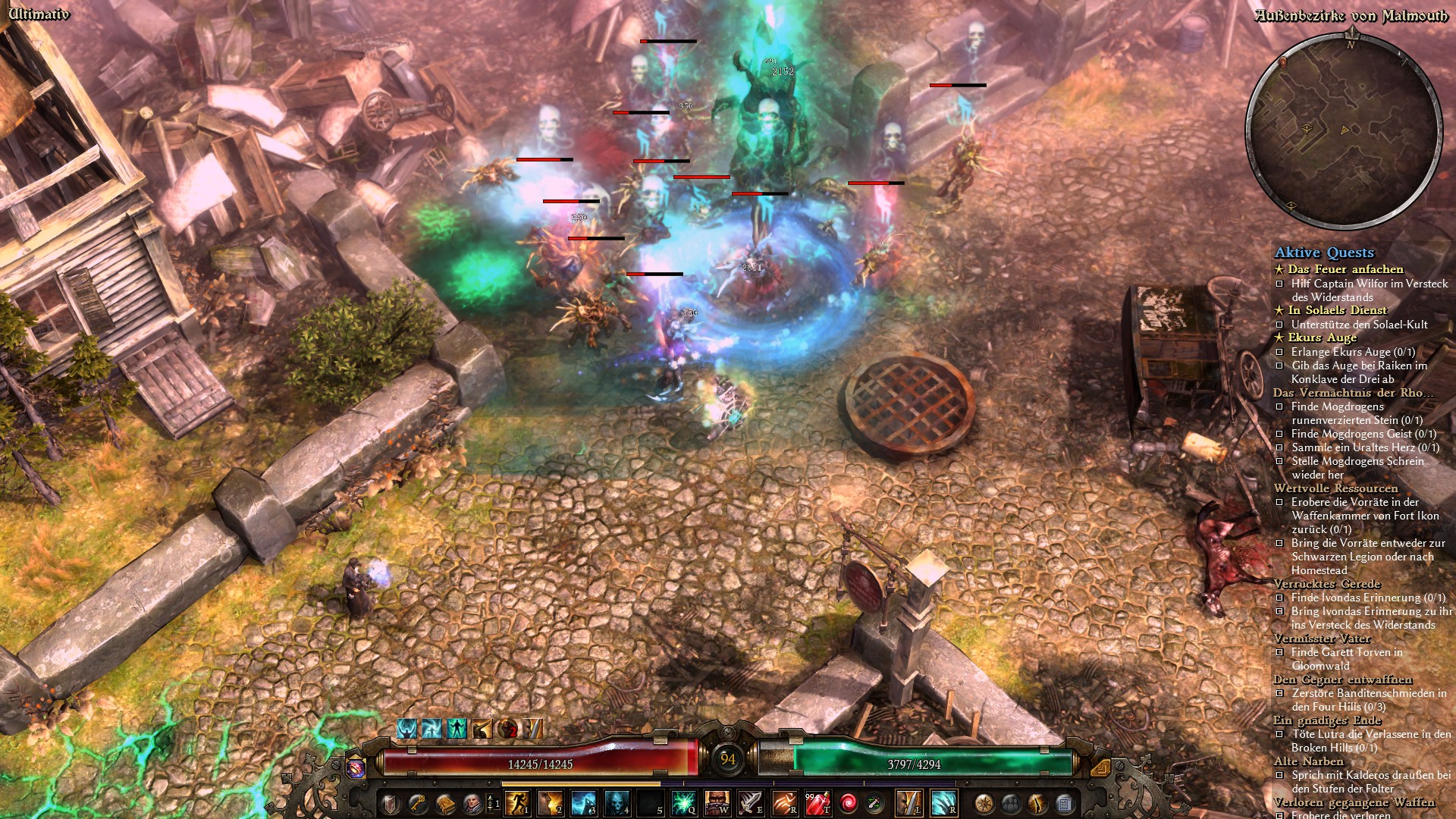
The race blends with the creature’s name and the most pertinent information, the health, is further away from the action.
We’ll look into getting a smaller version for you guys, but that approach is definitely not what we’d go with.
I rather see if the hero is arcane or something than how much health it has.
Your vision focus is in the middle of the screen, having to read a monster name that takes up 70% of the screen width means that your pupils have to zoom out to read entire name, then zoom in again to take part in the action - that is not an effective HUD imo if your eyes need to work more than your brain 
Sure some information is in different regions on the screen, but it is much easier and less costly for the eyes to move compared to zooming in/out.
Thank you Zantai, that means a lot. Personally, I have no strong opinions on what order should the text be in, or just how the text and the healthbar should stand in relation to each other. What bothers me is the new font, which is difficult to read quickly, but first and foremost, the size of it. It’s great that you’re taking our feedback into consideration, it really is.
Totally this ^
I prefer the old monster hud too. It’s plain and simple as it should be for something that is always popping in and out of the screen. Hope that Crate revert it back.
Or at least keep it as an option for those of us who prefer streamlined HUD and UI
I found the game nearly unplayable in its current state without GI. There is really no point in having hp bars when you cant filter trash from bosses and they dont give you the relevant monster info. Not to mention all the things they did with the fonts and stuff.
I was really excited when I saw they were implementing most of these features everyone liked from GI. I saw theres a hotfix coming to include things like player hp above your char. Im hoping they also include changes or at least further customization for enemy hp bars and how their info is portrayed on the screen.
There is a suggestion thread for exactly this. Go add your 2 cents to it. All we can do is ask.
Is there? I was looking for a place to provide this similar feedback but this looked like the only active thread regarding the new hp bars. Can you link to the thread youre talking about? This website is very difficult to search/navigate
That’s actually something which i would agree with, and i also hope this decrase of the size will be optional too, because for me the new top HUD bar is actually pretty perfect, because unlike before i actually see the thing and the old one besides the Design, which i find pretty outdated and bad aged, never used it, because i either didn’t use it, or if i did look up to it, it did kill me.
With the new approach of 1.1.4.0 i actually see that thing, without loosing the focus and without have the feeling the whole thing is bloated, and it also fits (as well the new Font) perfectly and visually appealing and i feel more immersed with the Game. It would kinda hurt to lose that…
So i really hope that Zantai consider, if it’s not too much work, that they rather give us option like two or three Sizes to chooses from for the Monster HUD, and if they change the fond make it toggable so people who like the new font still can use it (like me).
I made a screenshot of how it does look for me, and if you look at it you will notice, that compared to how big the questlog[and i’m not talking about the fact that i have accepted to many quest, but rather to show size of the questlog itself) and the Minimap (and yes i know you can toggle it off or use the smaller one like i do) you will actually see that the top hud is rather normal.
/edit:
I have to disagree with you… because the classic top hud was a reason why i often tend to die, because i had to lose the focus and look up to the healthbar. That’s why i actually almost never used it and didn’t cared about it much, and it wouldn’t have made much differently for me if we would’ve even be able to toggle of that thing, because it was useless anyway.
The 1.1.4.0 Healthbar is differently, besides that they (finally) catched up visually, and fits the theme / overall hud of the game so it’s more immersive, it’s actually (more) visible unlike the old one and i can focus more on combat (plus the new on-screen healthbars which helps with this too), plus i actually read informations out of it.
Normally, if we wouldn’t 've gotten the 1.1.4.0 update, i wouldn’t had complained about the old one, because this was one of these things which for me was something which never thought it never needs to be adressed and to want to have something better(which i’ve gotten now) until crate introduced it to us.
I really have no issue, if crate consider to add an option to toggle to the old one, but i really hope they don’t remove the new one.