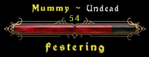
Health bar is fine, but monster name and properties display, not so much.
I think the monster name can be written with the same font as “forbidden domain” and “Enemy Hero killed”
Health bar is fine, but monster name and properties display, not so much.
I think the monster name can be written with the same font as “forbidden domain” and “Enemy Hero killed”
Just throwing in my 2 cents. I like the new font, the ornate health bar, the format, the overall design…
EXCEPT, as others have said, the sheer size of it is way too big. It’s almost comically oversized.
Considering most of the game has you heading north, this new HUD element seems to constantly be in the way now, obscuring enemies and just generally feeling intrusive. Eagerly looking forward to whatever you can cook up. Thanks for all you do.
Alright here’s another quick mock-up
That way the most important info is the most visible. Monster Race isn’t that important, so moved to the top next to Monster name, both reduced in font size. Monster property is very important for many monsters, so moved below HP bar. As the property is just a single stand-alone word, it’s font size could be even smaller and still be well readable I think.
I actually think that the space between the letters is too much. it’s like they’re too far apart and hard to read at first glance.
Yes, that too. The font design, spacing between letters and size of it all…all of that’s problematic.
The lifebar design is great, though.
Honestly I’d sooner a checkbox for “classic” hud. I’m very fond of the previous style I’ve grown so used to.
It would be cool if there was an option to not show enemy health at all.
It would be MUCH more exhilarating to play hardcore this way! 
I like, that you can see monster name/rank without need to hover around with mouse, especially useful in clusters. But HUD is gigantic and also font is little hard to read, especially in harsh environment. So maybe can be made best from both worlds ?
Well maybe someone consider to modd an no-hud mod in for your needs, if the devs won’t introduce it officially. (or you look into it yourself)
The monster HUD is too large. Way too large. It’s intrusive and steals your eye’s attention instead of allowing the player to focus on the action on the screen.
Please revert to the original HUD or allow people to choose which version they want.
OR
Make an individual resize slider for just the Monster HUD so I can make it as small as possible.
Right now the new monster HUD is 3-4x larger than the old one and it’s too intrusive. I can reduce the size of it, but the player’s HUD is tied to the same slider. To get the new monster HUD down, close, to the size of the old monster HUD means I slide the UI resize all the way down…however, this makes everything else way too small on my 5760x1080 resolution.
My focus now is the monster HUD and not what is actually going on in the action on the screen. Please, fix the over-sized monstrosity (no pun intended) that the new monster HUD is by reverting or having it be on it’s own resize slider.
I use UI scaling because my eyesight isn’t well enough and I stopped playing 1.1.4 just after 5 minutes. With UI scaling new HUD takes ~1/4 of screen size, I literally can’t see enemies. Also new font family (I don’t know is it gothic or not) absolutely terrible, this font is too dense. Please, please, Crate return old HUD and old font. I can understand large HUD for bosses but not for trash mobs. Why? They all die in 1-2 sec. I’d love to have an ability to enable new HUD only for heroes/bosses.
I think that besides changing the new font to something more readable and reducing the size of the Monster HUD, slightly reducing the Dangerous Domain indicator would also be a welcome change.
When I get home, I’m going to try utilizing Grim Internals to see if I can’t remove some of the awful monster HUD.
It might be worth looking into. [Tool] Grim Internals
Grim Internals is great. Im just scared the person who made it will stop updating it. Game was unplayable without GI
i’d love that too, i dont want that who likes the new bars are unhappy, but just an option for those who dont like them.
i find em really really unreadable, the big bar is useless, just fancy decorations.
but im just a minimal lover.
the option would make both (haters and lovers) side happy i think
im not a programmer so i dont know if they can re-add that in the game.