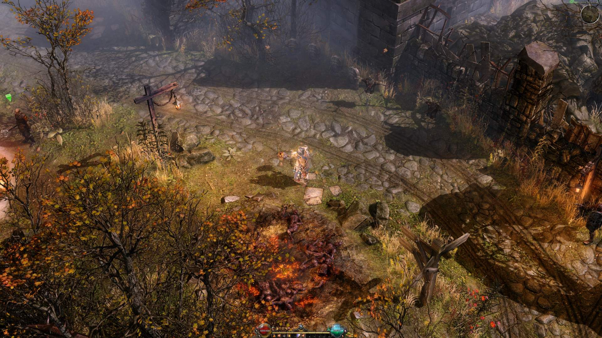
After i saw the stream yesterday, i saw Rektby all the time playing with the legacy UI and a while nearly the end of the stream he is playing with the orbs UI.
First of all I like this UI. But i fullsized the stream fullscreen to see what are the dimensions. And i mean the new UI is a little bit to small.
For me the symbols of buffs and debuffs are to small. Is it possible to increase that a little bit ore scale without changing resolution?
I also think this is a accessebility thing.
Thanks
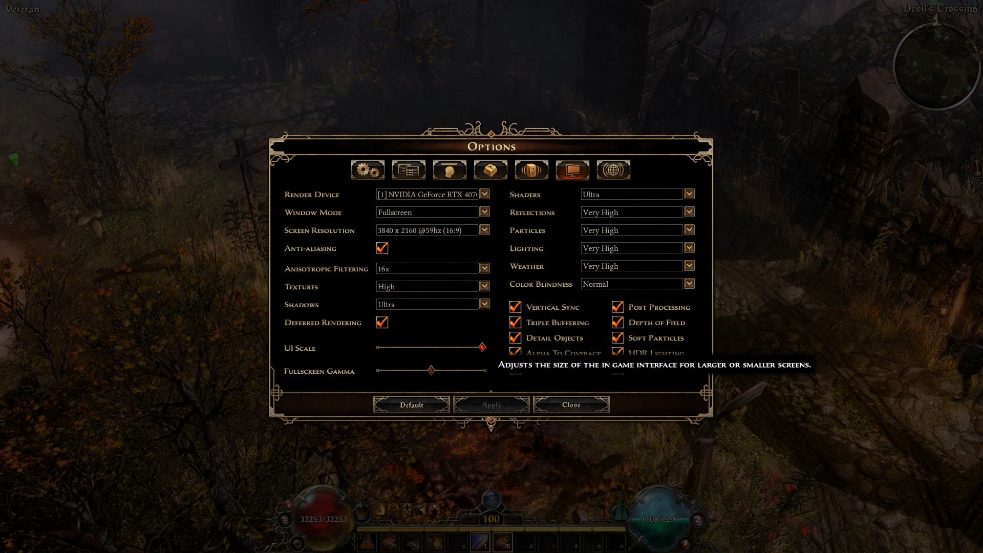
Have you tried adjusting the UI Scale slider?
Small:
To Larger:
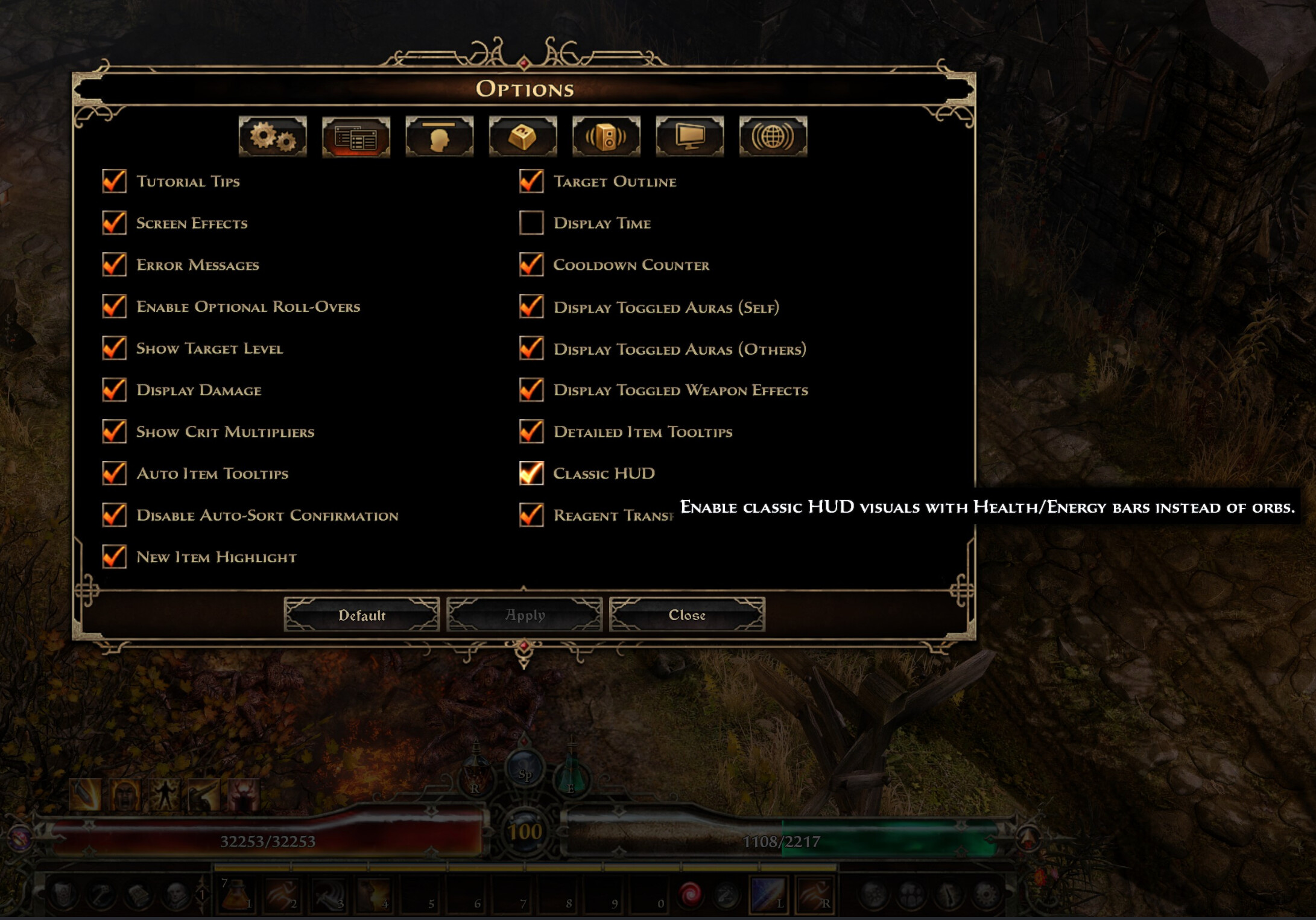
I may be one of the few, but I don’t like the orbs. I like the bars better. So, there is at least an option for the older UI? If do, I’ll take that any day.
WOOOOOOOOOOOOOOOOOOT!!! There it is! The refresh looks cool too. Crate knows how to make players happy. Take that other gaming studios.
1 Like
As a Orb-Hud Lover in generally and as someone who finds that an ARPG doesn’t feel right when they don’t have it (but obviously not that makes it unplayable, it’s more like when you play an first-person shooter, look down and don’t see your foot) i already can tell that i may never look back to the bars. Esp. since Crate did (IMO) an fantastaic job. Only thing - and that’s not on Grim Dawn itself, but a pure personal issue, i love just the traditional blue mana more… (but obviously for GD that wouldn’t work so again purely personal opinion). But i agree it’s great to keep it as an option for people who prefers the old.
in general, maybe it’s only me, but if it comes down to HUD (visually) they always had a good, and with this one they may have even outdone themself. Because they really nailed with this one to have a more modern and polished look, while still maintaing personality/character and fitting the atmosphere.
Again i dunno how others feel but too many modern games have a very clean/sterile, minimalistic HUD (in terms of visuals) and i’m not the biggest fan of them (most of the times).
The only thing which really sticked out in the recent livesteream with rekt and zantai, was these dropdown list (where you assign skills/items/modifiers for potions etc) that would’ve been amazing if that would’ve some sort of stylization fitting the Hud-Rework (and tooltips maybe too).
1 Like
This scales the whole UI incl map and questlist and so on …
What i mean that there is really a size differenz if you are not scaling between the icons and buttons. These are very smaler in the orb UI.
I only saw it in stream and today at youtube in fullscreen mode. Im not on playtest. I only can scale the old UI live.
But in stream and at youtube video i can clearly see a difference.
I will wait until it is coming out. I dont want to have it earlier  so if i could scale it i little bit up without the other things like map and questlist fill the rest of the screen its fine, but i think the scaling increases these things too much.