I still feel that the item descriptions on 4k playing on a TV is too small even on the highest UI scale settings, the quest description I can’t even read with the current font size.
Is there any way to make an option to just change the size of the text of item descriptions? I don’t play grim dawn on my sofa because I have to make so much effort to actually read.
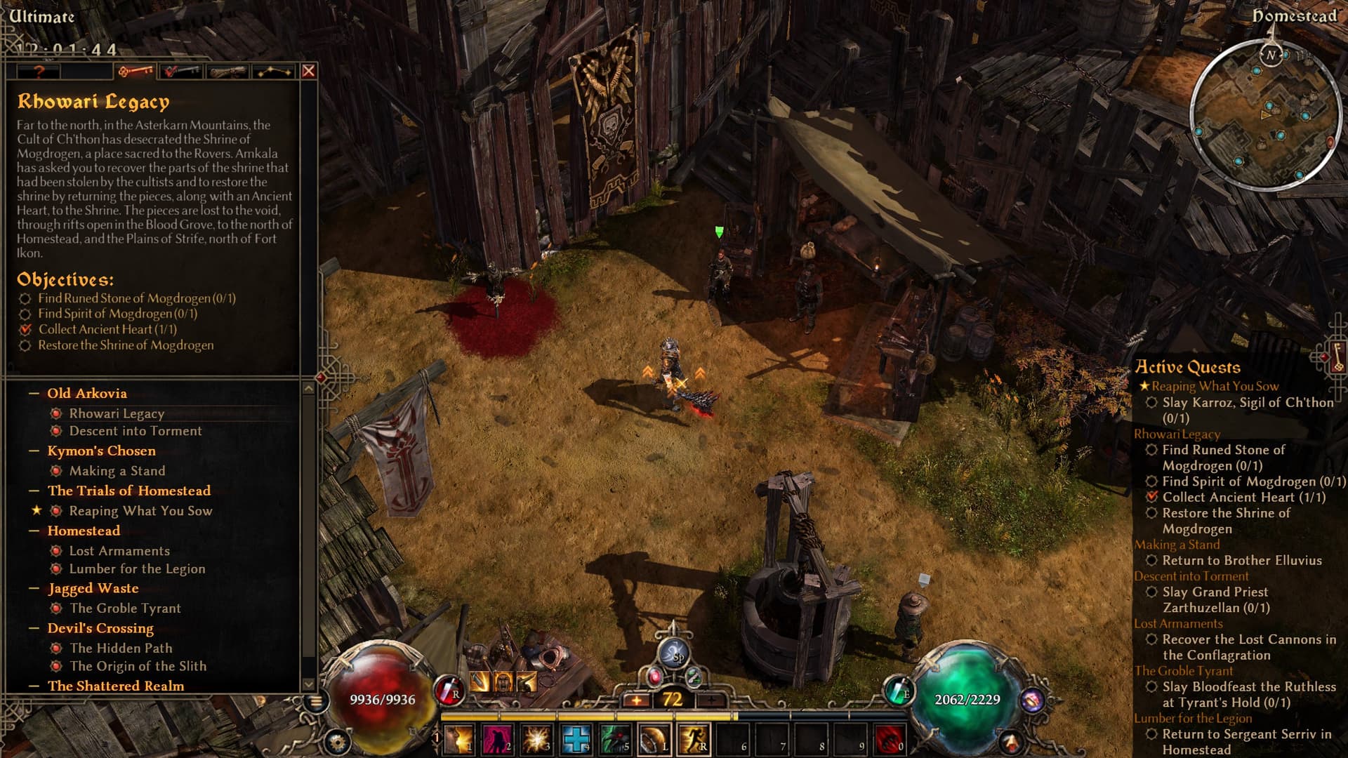
without a background the text would be so unreadable for me, you can collapse it and hopefully it they manage to remember that you collapsed it when you relaunch it might be the best change yet
I think the icon only appears when you hover as well, in general it looks very clean now even when active. In general though I like the transparent background from a readability perspective, though I have a high resolution screen so even when I have it open it doesn’t take up too much space for me.