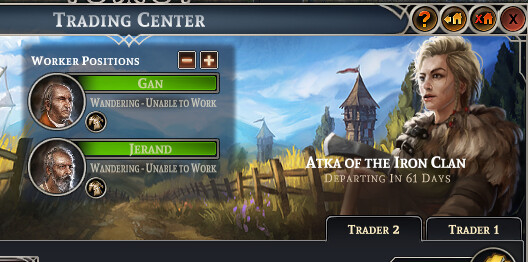
The text under the workers (worker status) is scaled differently than the rest of the text on the screen / game. It’s stretched vertically (or squeezed horizontally) to fit the space. I would recommend expanding the “worker” center shaded box to make it consistent. In addition I would recommend vertically centering it as it runs under the accent of the title box.