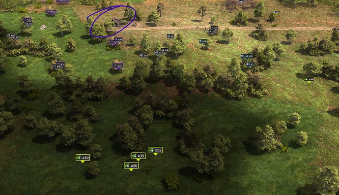
In this picture, it’s hard to tell which of the many resources are covered by the foraging shack and which aren’t. It’d be if the labels could have a small difference, e.g., dashed colored outline rather than the solid colored outline, or a different alpha / slightly grayed out. Would make it easier to identify unexploited spots.
This topic was automatically closed 90 days after the last reply. New replies are no longer allowed.
