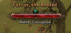
actually I quite like the new health bar in 1.1.4 . it’s everything else that needs improvement, particularly the item description text. the made it smaller in the new hotfix which I don’t like, it was already good.
Crate’s font is god-awful, impossible to read in a fraction of a second, which is what you need to do when a gang of Aetherials/Chthonians are dead-set on banging you.
You’re doing Lord’s work with these alternatives
@krell_154 wow that’s a huge compliment there, thanks. 
I also do not like other languages to be crammed up into fonts.arz. There should be a better way of doing localizations of different languages.
My next great idea is to piggy back localization technique , using language.def , one could define the font versioning , applying different typeface to use. @powbam had some idea of writing a new font switch utility tool at grim ui thread. I love that idea so that you could mix & match yourself. No promises but just an idea to switch published fonts conveniently.
Arc is easy to set up because only one file can be exchanged, but it is difficult to change one of the fonts. You can change each fnt freely by using “settings\fonts” instead of the arc file. How about thinking as an alternative?
@Matougi I tried the settings technique but the in-game fonts went jittery / shaking…no success there.
@stargater, I’ve noticed a few things. I’ve been using versions 2,3 and 4, and I saw this with all of them.
First, the racial description of a monster, which is below the lifebar on top of the screen, directly touches the lifebar. Maybe it would be better if there was a small, small space between them, just barely perceptible.
Secondly, I think there is a problem with a particular color of the fonts, and that is a shade of brown. In that color the name of the player in the inventory screen is written, and also the name of hero monsters. That font color can be somewhat difficult to discern, particularly on the Monster HUD, when the hero’s name is written against a background of burn effects, e.g. I don’t know if there is anything you could do about it, I suppose it would be a bit complicated.
Thirdly, do you think there is a possibility that we could use custom fonts only for the Monster HUD, and retain the default fonts for other text? The one thing that kind of bugs me is the squished letters on the world map; and increasing the UI makes lifebars disgustingly big.
And finally, and this has nothing to do with your mod…man, I’m really frustrated with the new Monster HUD. If only they gave us an independent slider for adjusting it. I really like my monster lifebars small, but if I adjust the UI scale, then I can barely see item descriptions, or the inventory screen. If only that could be modded somehow.
Oh well, you can’t have everything.
Please don’t take these suggestions in the wrong way, I think your work is wonderful, and I love the Kotori Rose font for Monster HUD. It’s perfect.
Ah, certainly fonts shaking is a problem. In my experience, fonts shaking occurs when there are several fonts in a single fnt and the size is not suitable. However, the cause may not be clear, so if it can be fixed by arc, it will be good.
The position of the monster name can be changed with FontForge.
@krell_154 thanks for the positive feedback!
Unfortunately, hud framework is outside of my control. I am merely select the desired font , test it if it’s clear, then repackage it into fonts.arz
I will publish a 9.2 version of kotori monster hud for your desire.
My intention is to replace all of crates default font as I think they are not ‘friendly’ enough for a lot of players, particularly older players like me lol. It’s hard to satisfy everyone’s eyesight as we see things differently. Hope u understand!!
Maybe someone else could help with using font forge to adjust the spacing down a little with the small letter on monster hud.
Thank you very much! I realize it’s hard to satisfy everyone, but you seem to be helping a lot of people!
I will also test an expanded font type for savapromedium.fnt this will be the world map font for players wanted a smaller GUI setup to prevent letters squishing together.
1 Like
@Matougi now I just realized why /settings does not work. In asset manager, a single fnt file , you could define the fnt attributes like 10 different sizes of the fnt font that will match the game’s bmp font rendering that’s hardcoded in the dbr database. Criticalhit has only 1 attribute , that’s why /settings worked.
It doesn’t matter. I’ve been using a lot of fnts that contain a lot of fonts directly in “settings/fonts” for a long time. I wonder why it doesn’t work for you. 
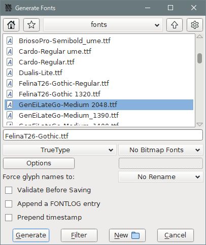
OK, I adjusted the metric of FelinaT26-Gothic.
Decompress this and use it as it is. (Metric: Win Ascent 1047 ≫ 1448)
FelinaT26-Gothic 1448.zip (85.0 KB)
@Matougi great work. you are more knowledgeable than me …
Are you able to provide me a word document on how you adjusted this using fontforge?
my email is [email protected]
My article on creating custom fonts is quite old and needs to be rewritten. I was going to add this commentary at that time. However, rewriting the article is very time consuming.
Ok, I’ll send you a memorandum on how to change the font position with PM. It takes some time, so give me time to compile the article.
Great thanks a lot. Much appreciated.
I am facing the same issues with Kotori Rose font on Monster Hud. Luckily you came to the rescue.
I played around with fontforge and got no idea how to locate the Win Ascent on metric option.
I retested /documents/Grim Dawn/Settings/fonts/ all the custom FNTs
It’s working this time round. Maybe, i did not include the correct FNT attributes when i recompile in asset manager.
So, Shall i now republish using /settings folder from now on ? This way, there could be possibilities that @powbam could write a utility to allow yourself to mix and match fnts files to your likings…
This would be created on a new thread. Some players do prefer the fonts.arc clean up and overwrite as they contains other langauges that they dont need it.
Oh, are you going so far? That will save us time.
Just in case:
FontForge only targets the C drive folder, so create a folder like “fonts” in the document in advance and copy the font you want to synthesize there.
-
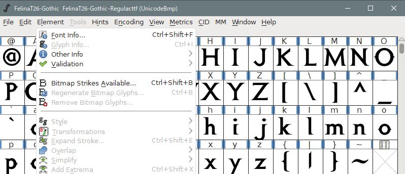
Click the font information from the element.
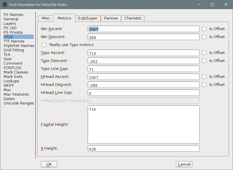
If you select OS / 2 in the left column, there is a metric tab on the right side of it that opens it.
There are various items, but to lower the font position, just change the “Win Ascent” value in it.
(If you can’t enter the value directly, you can paste.)
-
Increase the value by 100 units and press the OK button.
-
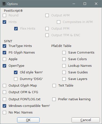
Select “Generate Fonts (G)” from the file and change the name of the font. At that time, check the options as shown in the figure.
-
Copy the changed font to the source of the font MOD folder in the working folder, and create linbiolinum_shadow-lg_spaced.fnt and nevisshadow-lg_spaced.
The database value is
linbiolinum_shadow-lg_spaced
Size 14, 20, Bold Outline, 1
(Monster health value during battle, Monster level)nevisshadow-lg_spaced
Size 18, 26, Bold Outline, 1
( Race name, Monster name)

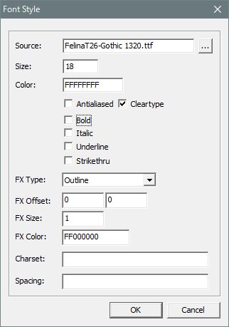
- For FX, choose the outline or shadow you like, and decide the FX Offset and size as you like.
Choose either Antialiased or Cleartype. Check bold as you like (on in database).
It’s done, but it won’t fit in well if you don’t make it a few times, so it’s hardest to determine the “Win Ascent” number.
@matougi thanks, I noticed you are using a true type font ? and not OTF font type? I got a lot of errors during regen for OTF format.
In the case of OTF, it must be converted to TTF at a site like Transfonter.