File is smaller as i had removed other languages and only English.
Highly compatible with higher resolution. I am using 3600x2024 resolution (thanks to deferred rendering).
https://mega.nz/#!q8lHnYqa!ixEdJ_48dQybBZETwz6bynrjNyfRXm8mvkQIGWonwBY
Step to install:
- Backup your grim dawn/resources/fonts.arc file
- Replace it with my fonts.arc
- If Crate patch again, the fonts.arc will be reset, just redo the replacement.
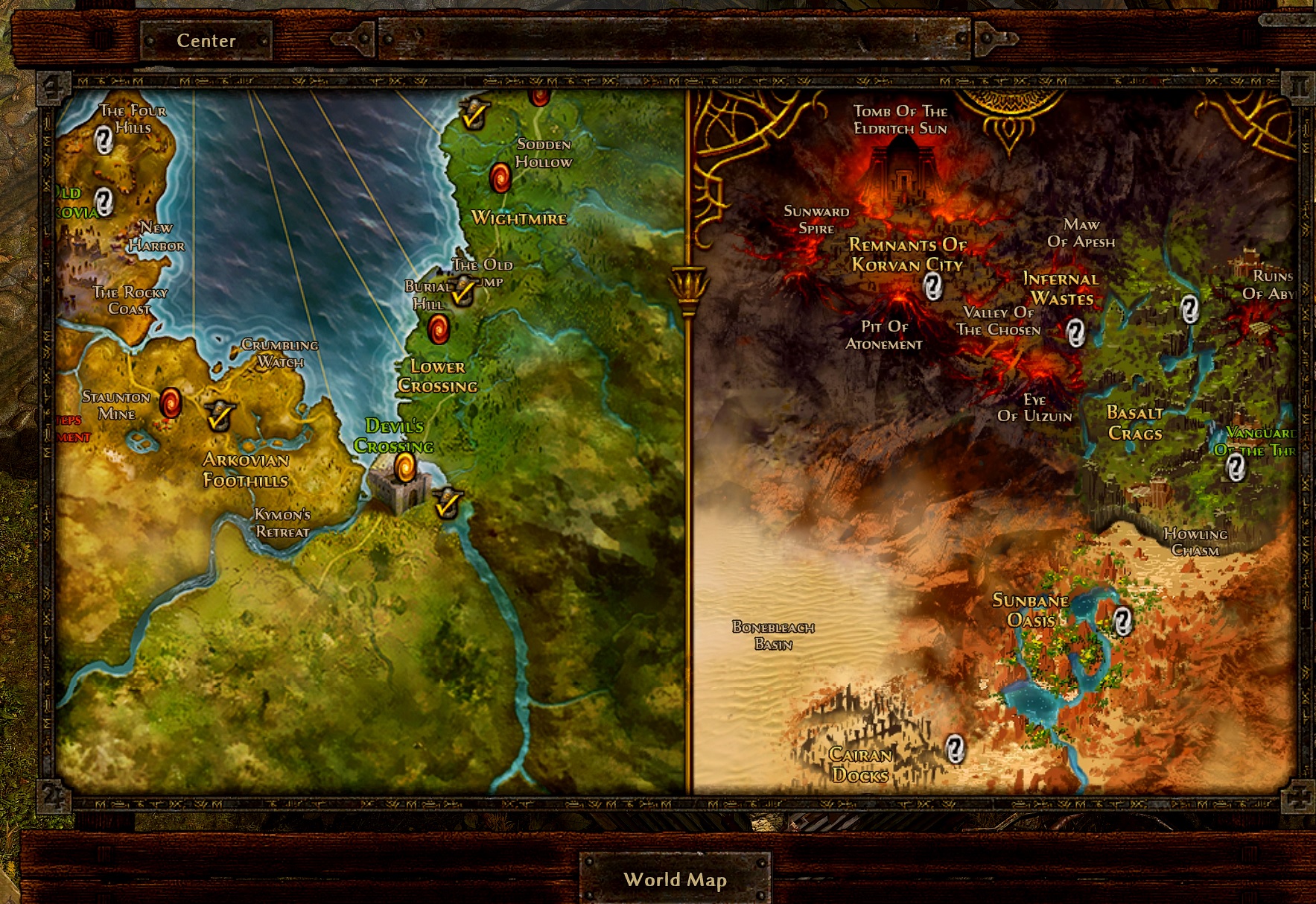
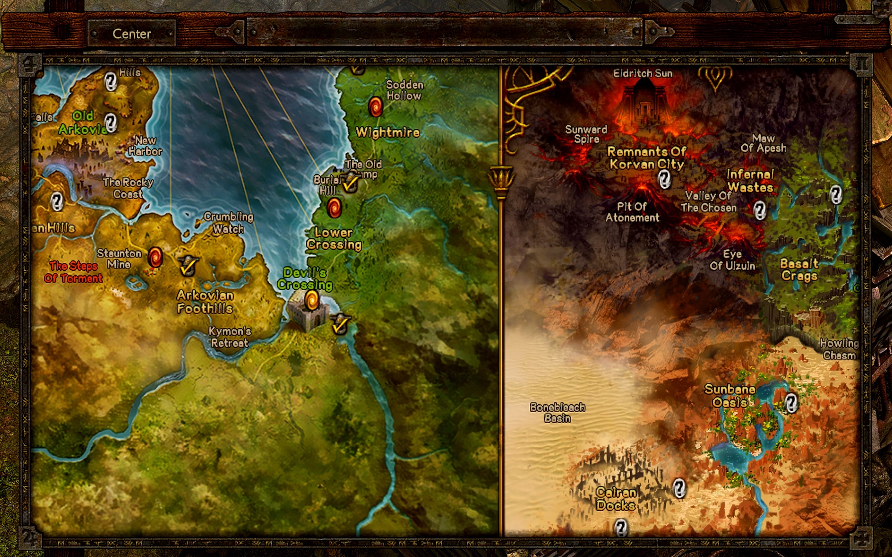
note : If the World Map fonts are squished together, you need to tweak your GUI rescale just by 1. This should fix it.

NORMAL CLEAN FONTS:
VERSION 1:
Sample pics below at my post (fixed the World Map - cleaner font)
https://mega.nz/#!DoUQ1SRC!9kJJab46RULPak2akMiqybtYRaHQuTE8sufBnFq7dVU
VERSION 2:
https://mega.nz/#!m5tiDK6A!arZO6rtUtKinFuYfbpBO8TL80VNA9xeE0hVltIPe0NI
sample pics at my posting -> you have to scroll down to my posting.
Changes for version 2: (This is to be in-line with item descriptions)
- Credits.fnt
- Cinematics.fnt -> splash screen font
- combattext.fnt -> smaller fonts compared to version 1
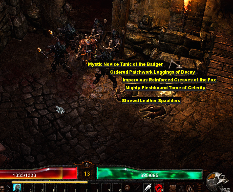
- Jura.fnt -> refined fonts for items dropped on ground so it’s not so cluttered, hp + mana font
- Titlescreen.fnt -> GD start screen texts
- Monster Hud -> it’s not so ‘up your face’ font
VERSION 3:
Version 3 (normal fonts) is up.
This time , i am using a free font KOTORI ROSE (KR font).
Sample pics at my posting -> you have to scroll down to my posting.
This version is also well-suited for players with eyes issues on screen.
Changes:
- Credits.fnt -> KR font large
- Criticalhit.fnt -> KR font large
- Titlescreen.fnt -> KR font large
- briosopro.fnt -> KR font regular (Items headings, dialogs is bigger[ i cannot control this])
- cinematic.fnt -> KR font regular
- jura.fnt -> KR font regular (GUI parts)
- linbiolinum_shadow-lg_spaced.fnt -> KR font regular (Monster hud - main title)
- nevisshadow-lg_spaced.fnt -> KR font regular (Monster hud -lower text)
- nevis.fnt -> KR font regular (Start Menu buttons)
- nevisnooutlinespaced.fnt-> KR font regular (Master window tabs etc)
- nevisshadow.fnt-> KR font regular (Game screen upper left difficulty level, upper right place name)
https://mega.nz/#!2kFVmCiR!qtWSR_GEyoGOMoPtJHNaUSpuw-xMYlafWIoBLD3HelI
VERSION 4:
Version 4 (normal fonts) is up. This now my favourite 
Using free font DESIGNSAUR (DS font).
Sample pics at my posting -> you have to scroll down to my posting.
Changes:
- Titlescreen.fnt -> DS font regular
- briosopro.fnt -> DS font regular (Items headings (slightly condensed), dialogs is now normalized with this font)
- cinematic.fnt -> DS font regular
- nevis.fnt -> DS font regular (Start Menu buttons)
- nevisshadow.fnt-> DS font regular (Game screen upper left difficulty level, upper right place name)
- Jura.fnt -> (GUI parts eg. Items on ground etc)
https://mega.nz/#!mx1GxS6Q!tFAOi3pSxZBXTh0X5vMkZ8zSnA-4p_IbiWCnV5GMvZs
VERSION 5:
(normal fonts with ROAD RAGE combat font) is up. Per @mamba suggestion.
Sample pics at my posting -> you have to scroll down to my posting.
Changes:
- combattext.fnt -> RR font.
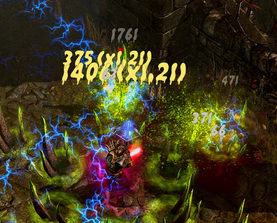
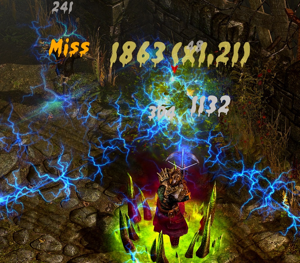
- Criticalhit.fnt-> RR font
The combat now looks like ‘Pretty Damage’ for Torchlight 2 mod. - nevisshadow-lg_faced.fnt -> This is monster hud font changed to road rage font. The ~ sign somehow is not renderd in road rage font hence it’s depicted as a “square” per diagram. I may find out a one suitable later with the ~ sign.
Everything else stays from version 4.
https://mega.nz/#!qklwkaxL!ZuZEGhZxLVp8sEdXjuORCeHXTVuOlXYWdSQZxTYEeos
VERSION 6 now has PRETTY COMBAT effect
(normal fonts with ROAD RAGE combat font and THE GRIMM MONSTER HUD) is up. I think it’s my best so far.
Changes:
- nevisshadow-lg_faced.fnt -> THE GRIMM font for monster hud. It’s font name is so fitting.
- Cinematic.fnt -> GRIMM font
new: Reupdated : Aug 5 2019 1:14 am PST. - linlibertine_r.fnt -> GRIMM font (Active Quest Column headers, achievement title headers)
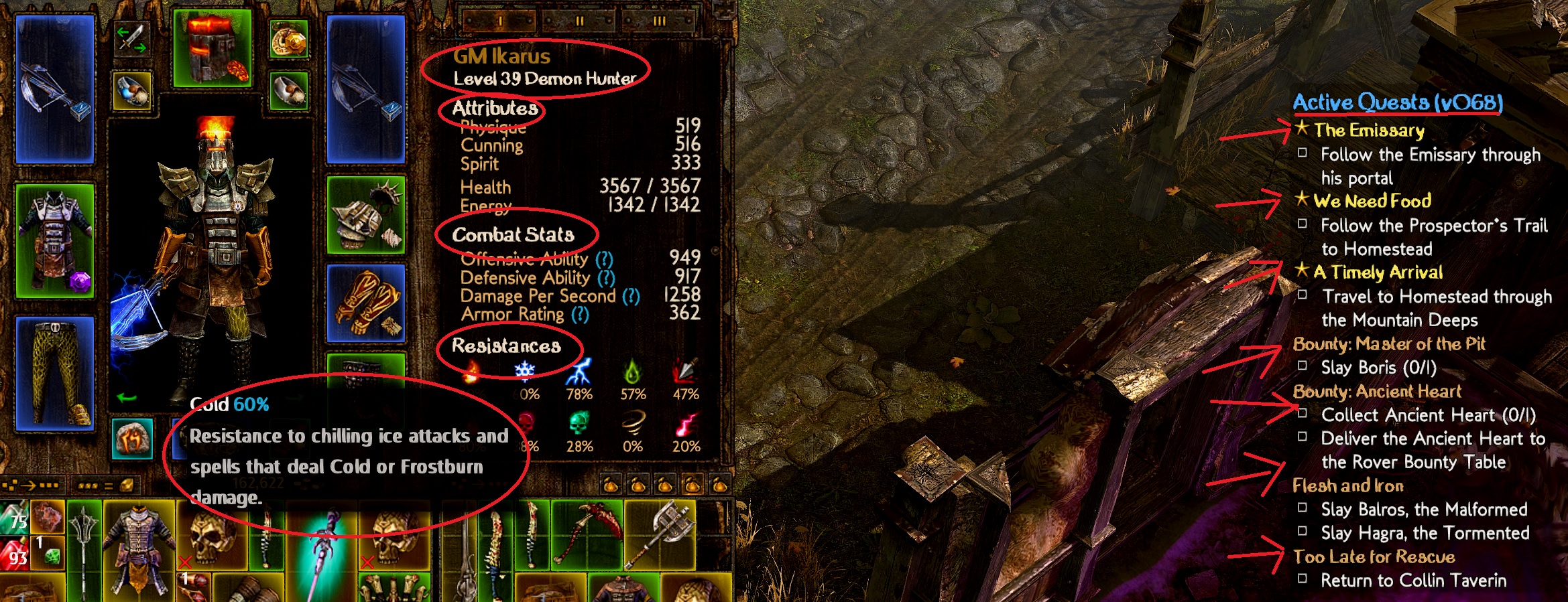
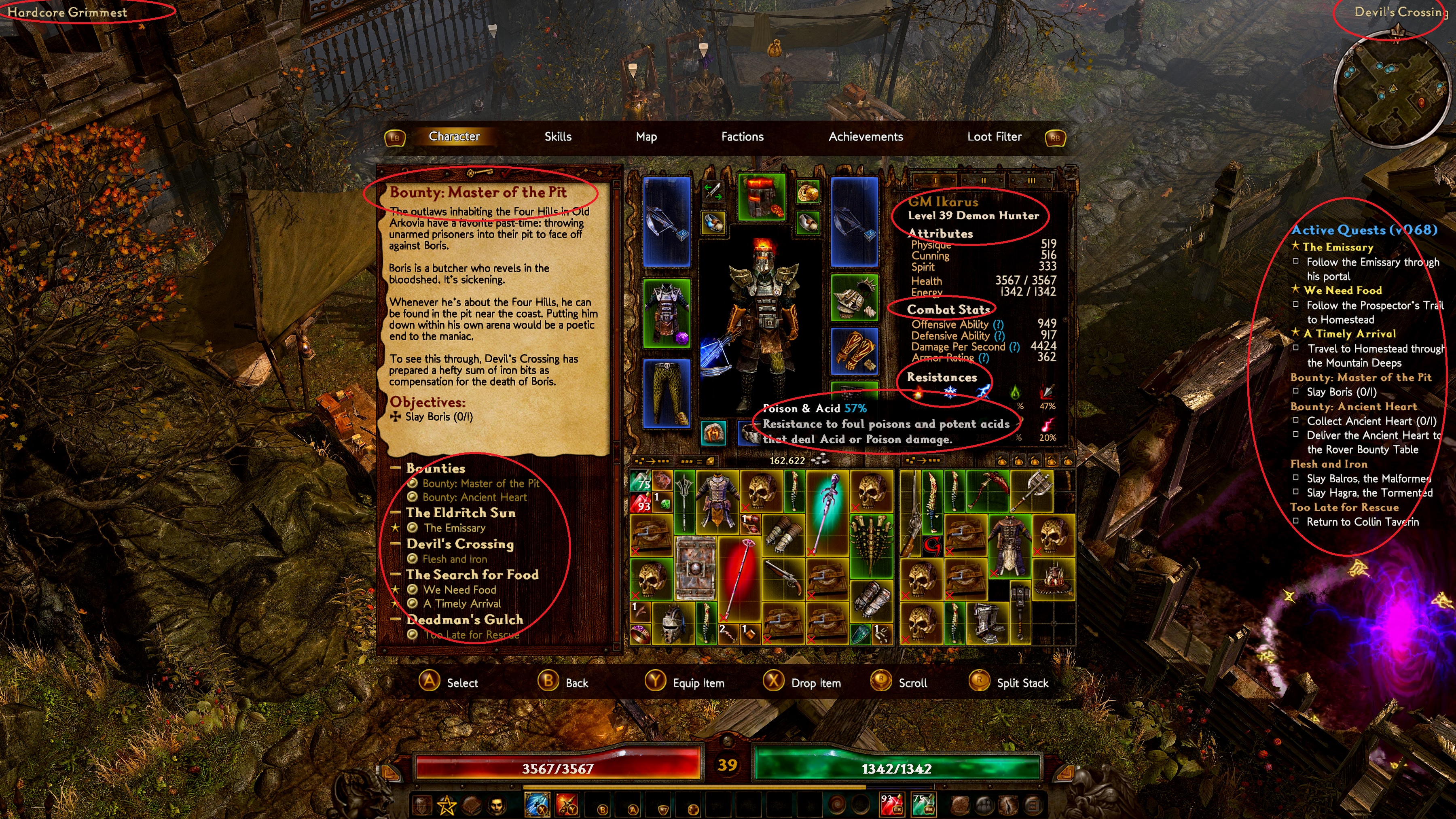
- linlibertine_r_nooutline -> GRIMM font (Player Name; class name; stats headers)
Everything else stays from version 5.
Edit : Reupdated : Aug 5 2019 1:14 am PST.
https://mega.nz/#!Px830aLS!VkUe8_cD4XNcxtKQCizJezJkQe7WxX-eowTXGcxnWAc
Edit :
Version 6 - alternate 1 : with combattext bloody bacon (removed road rage combattext)
https://mega.nz/#!vklijQaY!YbjbwlTA9cOIya3IUmZo_SGjVl7eU3EGkdF3Mh8h6R4

VERSION 7 (FELINA GOTHIC + WITH ROAD RAGE [pretty combat]).
Using new font FELINA GOTHIC (FG font).
Changes:
- Credits.fnt -> FG font
- Criticalhit.fnt -> RR font
- Combattext.fnt -> RR font
- Titlescreen.fnt -> FG font
- cinematic.fnt -> FG font
- jura.fnt -> FG font (GUI parts: Items on ground, Gear item name, Dialog slightly bigger etc)
- nevisshadow-lg_spaced.fnt -> FG font for Monster hud
- nevis.fnt -> FG font (Start Menu buttons slightly bigger)
- nevisnooutlinespaced.fnt-> FG font (Mastery window tabs etc)
- nevisshadow.fnt-> FG font (Game screen upper left difficulty level, upper right place name)
- linlibertine_r.fnt -> FG font (Active Quest Column headers)
- linlibertine_r_nooutline -> FG font (Player Name; class name; stats headers)
- linbiolinum_shadow-lg_spaced -> FG font (not sure what this is for patch 1.1.4.0).
Everything else copied from Version 6.
https://mega.nz/#!r1kDkQ6R!bTDttkepPZgHjexgcE_sq4SA3ODszt2i9u-IecSPTew
sample:
More sample screens at my posting below.
VERSION 8 (FELINA GOTHIC with BLOODY BACON combat).
Using new font BLOODY BACON (BB font).
Changes:
- Criticalhit.fnt -> BB font
- Combattext.fnt -> BB font
Everything else copied from Version 7.
https://mega.nz/#!6oNk2QTI!ehktrldDfgtLEUCQY-TmQuZnxVwKg4dNT6ZDKj5AUwE
VERSION 9 (FELINA GOTHIC with BLOODY BACON combat+DinRoundedBold GUI Parts).
Version 9 (normal fonts) is up with FELINA GOTHIC + Bloody bacon combat + DinRoundedBold
Using new font DINROUNDEDBOLD (DRB font).
A copy of version 8.
Changes:
- jura.fnt -> DRB font (GUI parts: Items on ground, cleaner dialog , Skill name, Skill attributes mouse over etc)
- Briosopro.fnt - > DRB font (A lot GUI parts effected, Item name, Interfaces)
https://mega.nz/#!3kVgUATB!ceIKAgZDh-ndXJstbRx7YycpNLy7H7pniDD2zAZhv8M
Alternate 9.1 : with RoadRage combattext and criticalhit
https://mega.nz/#!KgUVxKyS!S7uQ3lGrOgY2tg3yfrq1nPATMQOFaw9iPU8SKGnw008
Sample: [more pics at my posting below]
Alternate version 9.2 (RoadRage combattext+Felina Gothic+DinRoundedBold+KotoriRose MHud.
What a pain to adjust the Kotori Rose Mhud but thanks to @Matougi.
changes:
- nevisshadow-lg_spaced.fnt (main overhead mhud)
- linbiolinum_shadow-lg_spaced.fnt (clearer monster hp)
https://mega.nz/#!npUClAab!7LomrX066vqOW8520T5BH6Pgpe3Abo4wesBPR1hlx9c
Alternate version 9.3 is up with RoadRage combattext+Felina Gothic+DinRoundedBold+COLUS MHud.
Using new COLUS font.
changes:
- nevisshadow-lg_spaced.fnt (main overhead mhud)-> Colus font (used fontforge adjustments)
Monster hud wording now has fx2 black edges. - linbiolinum_shadow-lg_spaced.fnt (-> Colus font (used fontforge adjustments)
https://mega.nz/#!6pFRxAqL!ZsnC7fe_Nt2KxabvRHXdMJoFEvLcW9eEQxSOAv_czLM
Alternate Version 9.4 is up with ZANSTOKE monster level number + monster HP
Using new ZANSTOKE font. Useful for higher resolution players.
A copy of 9.3 version.
changes:
- linbiolinum_shadow-lg_spaced.fnt -> Zanstoke font (monster level number+ monster hp)
(a) fontforge adjustments to move down level numbers slightly
(b) fontforge individual characters adjustments for 0-9, comma, /, and brackets () so that it’s centered.
https://mega.nz/#!X9EAmKCb!2mcdfyNdtBDyGpKrN40wSieHdeeJlBsvUBywKMNktT8

Alternate Version 9.5 is up with VANILA EXTRACT + ANKO font+FELINA GOTHIC.
New fonts used:
A. VANILA EXTRACT (VE) - for combattext, criticalhit ( for players that wanted a ‘normal’ clearer combattext)
B. ANKO (AK) ( this is almost same as default GD font but clearer) - most GUI fonts are now replaced to this.
A copy of 9.4 version.
changes:
- Criticalhit.fnt -> VE font
- Titlescreen.fnt -> AK font
- briosopro.fnt -> AK font (Items headings, dialogs)
- cinematic.fnt -> AK font
- jura.fnt -> AK font (GUI parts)
- nevisshadow-lg_spaced.fnt -> VE font regular (Monster hp+level number) - fontforge adjustments
- nevis.fnt -> AK font (Start Menu buttons)
- nevisnooutlinespaced.fnt-> AK font (Master window tabs etc)
https://mega.nz/#!OxMkTA4J!u6dSLtXTxa2S9mghUcz-DL3TtmbGL9ZOr1OR_Q5JK8U
VERSION 10 (SALSA theme + FATMARKER+ CONCERT ONE +POLTERGEIST).
Fatmarker : Monster hud texts
Poltergeist : Monster level + hp
ConcertOne : Inventory items name , items on ground etc
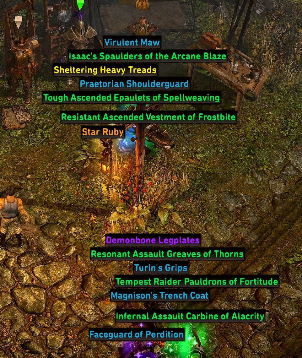
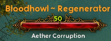
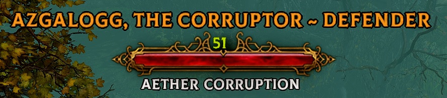
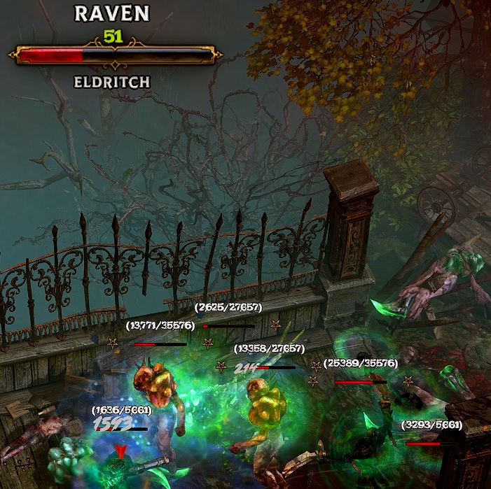
Salsa: GUI parts, Combattext, criticalhits, Start menu, Mastery /Devotion names, Character names/class attributes ,credits, Quest titles, Journal titles, Loot Filter, Dialog etc
https://mega.nz/#!Pk9AWIDT!AxrOQeVYERpj_UfsICSzsnhVJiZvZm9ZZg6cre2qF90
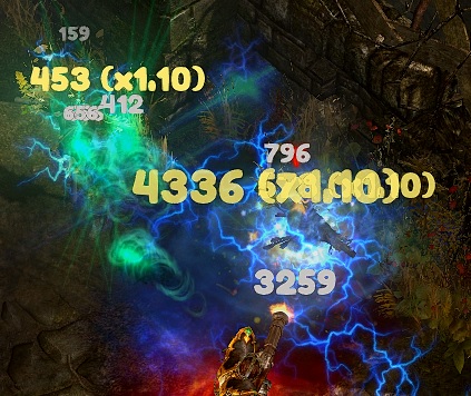
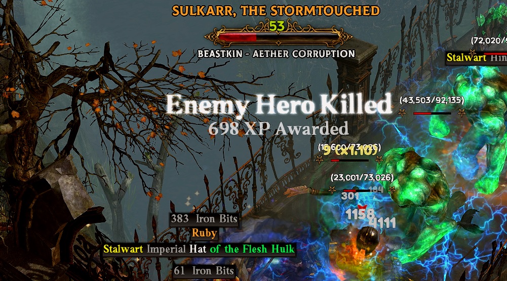
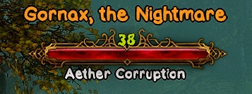
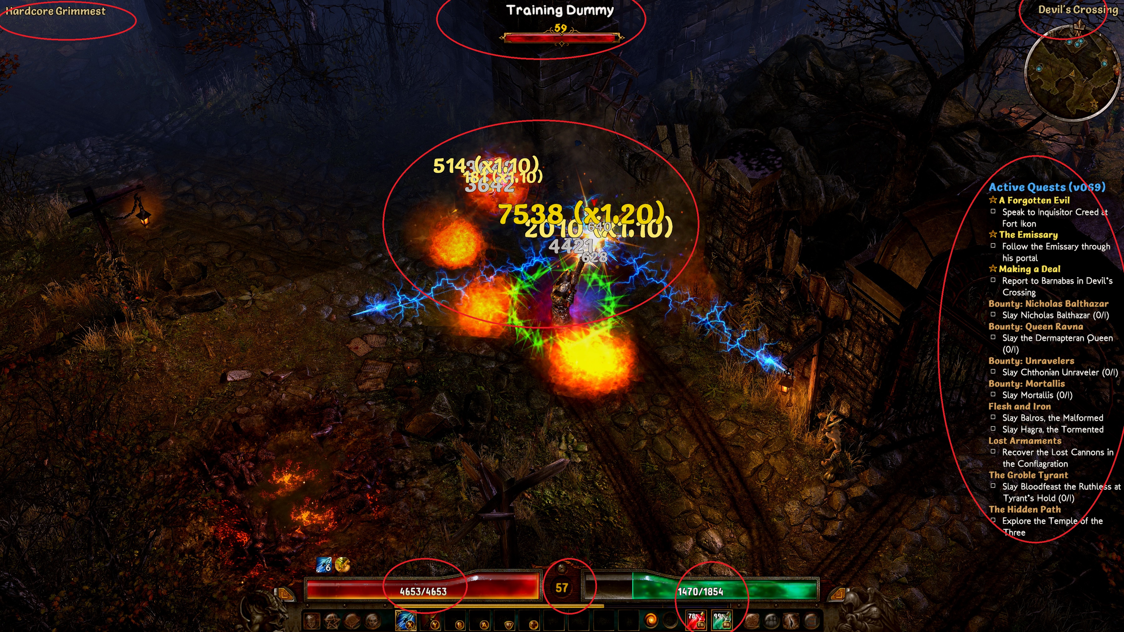
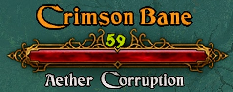
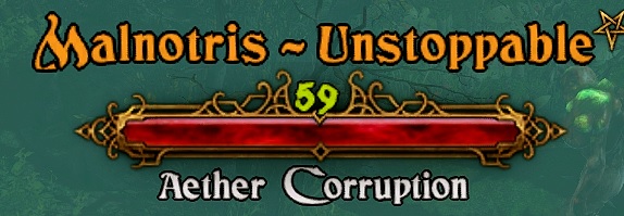
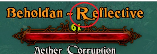
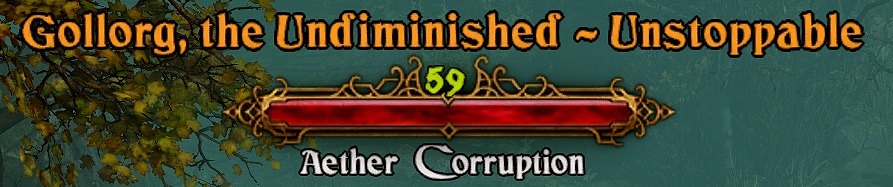
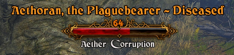
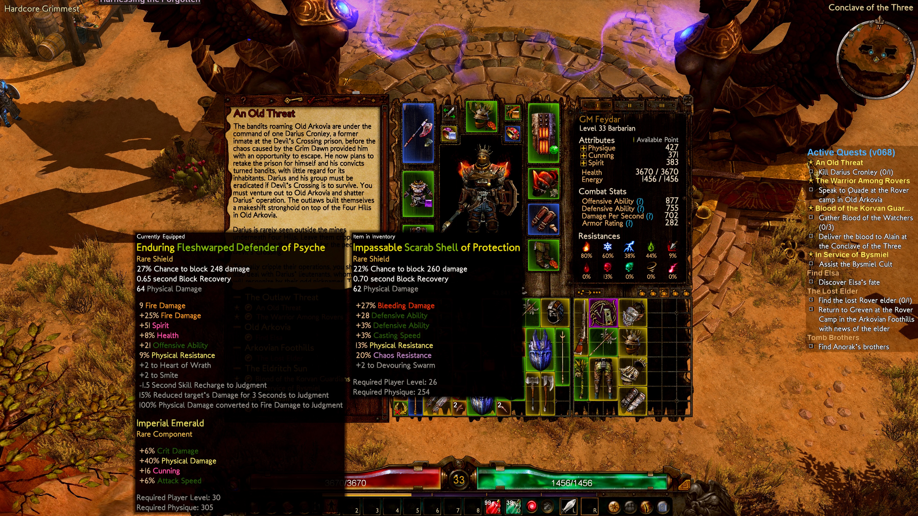
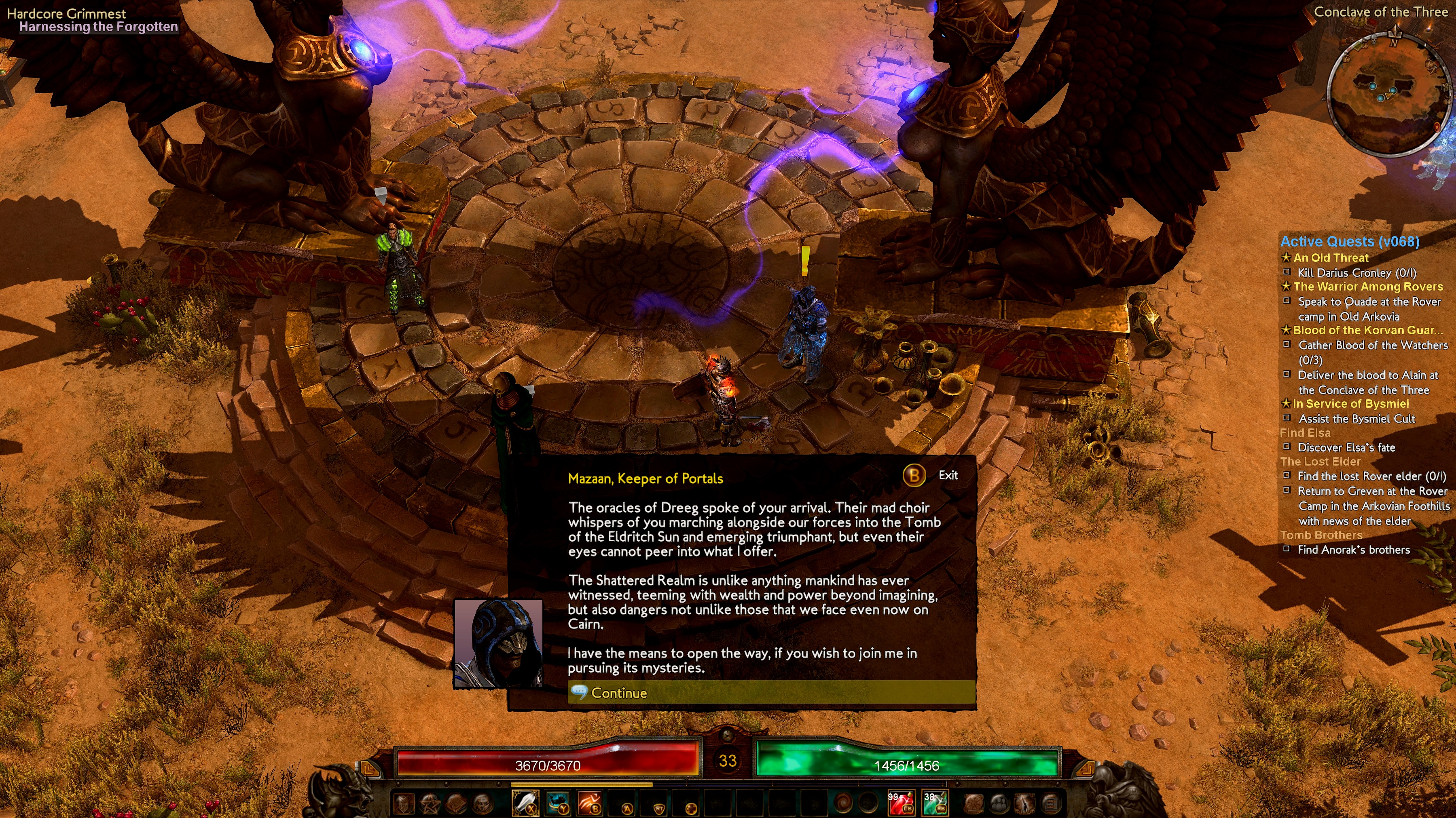
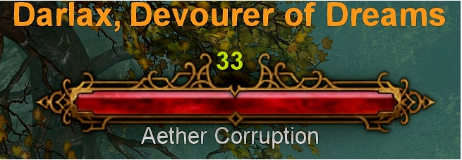
Just 1 image to satisfy your curiosity
Version 10.1 - SALSA theme + CTHULHU+CONCERT ONE+ POLTERGEIST
A copy of version 10.
Changes : CTHULHU font : Monster hud nevisshadow_lg_spaced.fnt (Name and monster type)
Pronouce as /keˈtuːluː/ - this is the HP Lovecraft horror font. I thought this is pretty fit for this game monster hud.
https://mega.nz/#!2pdi0azI!jb4TCujYsegiW1AjYq97EgQFuiYhGTbTYitQNxvZuqw : updated
Slight update: CTHULHU font was missing apostrophe ’ and the R was truncated , fixed both
Re-updated mega link with the new link.
https://mega.nz/#!2pdi0azI!jb4TCujYsegiW1AjYq97EgQFuiYhGTbTYitQNxvZuqw
Version 10.2 (a copy of 10.1)
Fira Bold - briosopro.fnt (Inventory item gears headings, dialogs) --> clearer dialogs (had to use this font for item gears so that it does not “shivers” on the item name).
Nunito-Bold.ttf -->Jura.fnt -> (GUI parts eg. Items on ground etc) -
Mega link : https://mega.nz/file/j49RyI6I#hhBrDeHHoY7ZAXdaZFeAPq0U_35L50lFQGdSzd3y7LY
Version 11 (a copy of version 10)
Combattext.fnt - > Bloody bacon (for your halloween fans)
Colus font - > nevisshadow-lg_spaced.fnt (main overhead monsterhud with fx2 black edges)
Colus font - > linbiolinum_shadow-lg_spaced.fnt (Monster hud level and level text)
[NEW FONT] Robaga bold - > linbiolinum_sansserif.fnt (Player items stats , GUI parts etc) -> Bigger font size for visual impaired
[NEW FONT] Nunito Bold - briosopro.fnt (Inventory item gears headings, dialogs) --> clearer dialogs
Jura.fnt (GUI parts: Items on ground, cleaner dialog , Skill name, Skill attributes mouse over etc)
https://mega.nz/file/X19CiCDI#eIoXC8dT2O1omjv97Ux729AB7X2bqe6g3AaK7AaWcRY


 Is it simply too much work?