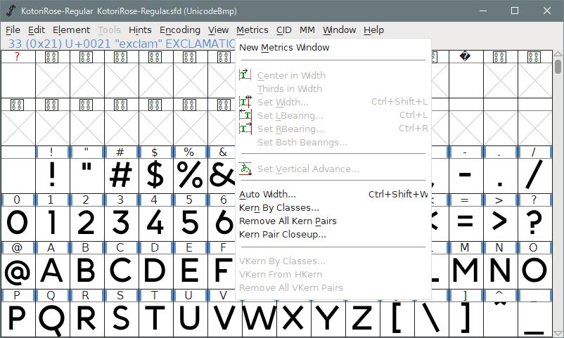
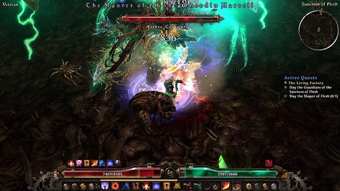
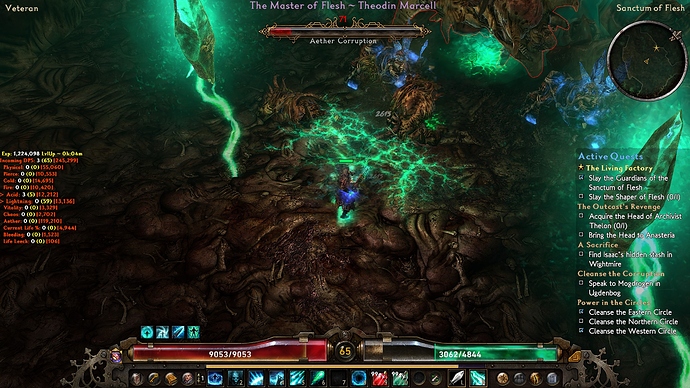
@matougi, could you give me a fontforge screenshot of where do i adjust the 0-9 font type individually ? I dont mind testing it. But someone will have to test 100 if I managed to come up with the 0-9 horizontal adjustments.
The level number is on which FNT ?
Are you really going to do this work?
The work is simple, but it will take a lot of time by trial and error. 
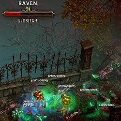
The monster level and health value during battle are displayed by “linbiolinum_shadow-lg_spaced.fnt”.
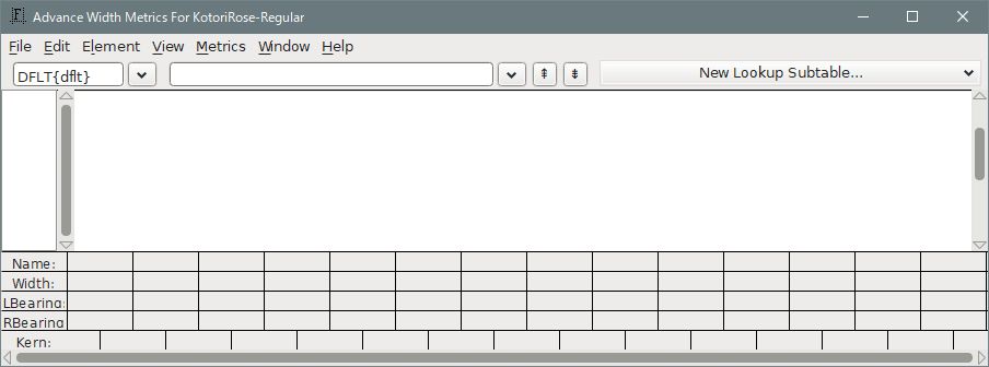
- Select “New Metrics Window” from the menu “Metrics”. Advance Width Metrics Window opens.
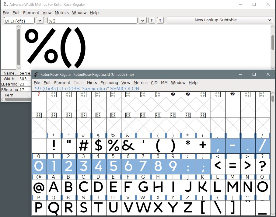
- Drag and draw the numbers and symbols that need to be changed into the window.
-
Change “LBearing” and “RBearing” of each font to an appropriate number.
Increasing the value of “LBearing” moves the font to the right. And the same value is subtracted from “RBearing” to keep the font width. So it is good to add or subtract 450-500 to the numerical value of each font beforehand. -
This value depends on the font and must be determined by repeated gameplay.
-
In addition, do not forget to change the vertical position of the font.
There is no problem in position, but FelinaT26-Gothic feels a little big.

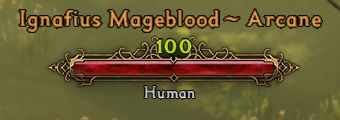
Colus font monster hud.
So, I successfully converted COLUS FONT using FontForge …
Without fx 2 side edging: (level 51 word not fixed, just to show you fontforge could correct slightly)

With fx 2 side edging: (still need to adjust the level 51 word to the center?).
Anyone interested ? if so, i would publish it the Colus font monster hud with black edges. I now officially liking Colus font monster hud with fx 2 black edges.
if the space is because of the eventually 3 digit level then I’m okay with it.
@matougi there is too much work… and too much testing to be done to just move the level numbers. I think my 9.3 version should be good enough?
Version 9.3 is up with RoadRage combattext+Felina Gothic+DinRoundedBold+COLUS MHud.
Using new COLUS font.
changes:
- nevisshadow-lg_spaced.fnt (main overhead mhud)-> Colus font (used fontforge adjustments)
Monster hud wording now has fx2 black edges. - linbiolinum_shadow-lg_spaced.fnt -> Colus font (used fontforge adjustments to move down level numbers slightly)
https://mega.nz/#!6pFRxAqL!ZsnC7fe_Nt2KxabvRHXdMJoFEvLcW9eEQxSOAv_czLM
That’s good enough. If you keep doing this, it’s bad for your health. 
Version 9.4 is up with ZANSTOKE monster level number + monster HP
Using new ZANSTOKE font. Useful for higher resolution players.
A copy of 9.3 version.
changes:
- linbiolinum_shadow-lg_spaced.fnt -> Zanstoke font (monster level number+ monster hp)
(a) fontforge adjustments to move down level numbers slightly
(b) fontforge individual characters adjustments for 0-9, comma, /, and brackets () so that it’s centered, fx 1 on black edges for monster hp.
https://mega.nz/#!X9EAmKCb!2mcdfyNdtBDyGpKrN40wSieHdeeJlBsvUBywKMNktT8

hello
is it possible for the Topic creator to do a Monster HUD (same size) as it was in 1.1.4.0 ? or telling me how to increase the monster-hud-size of his own Fonts? other Things doesnt matter. Thanks
@kingwill not sure what u mean,i do not increase the monster HUD!!
This is awesome, really loving the COLUS and ZANSTOKE fonts, the black edges are very useful!
I was wondering, could you do a version of these fonts, but without Road Rage combat text? Maybe using the COLUS or ZANSTOKE fonts themselves for combat text? COLUS seems maybe even better.
In any case, thank you very much for all you have done!
@krell_154 sure, i am always up for a request, now that we know better (thanks to @matougi for helping me all the way) . Please note i do not increase the monster hud… as @kingwill thought i did. lol
The Zanstoke fonts is huge expanded font, it’s not suitable for combattext as it’s too big.
My intention for Zanstoke on level number is for players that play a higher resolution but the monster level text became so small after that.
I did’nt like Crate’s monster level number and monster hp as it’s too fuzzy…it’s using a san serif font.
Halloween ANPAD font.
Not sure anyone keen on this ?
I managed to correct the spacing, looks pretty cool with new Anpad combat text + criticalhit+monster hud level +hp.
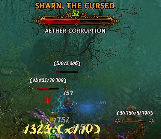


he means that can you restore the size of the hud like it was in patch 1.1.4.0, because they made it smaller in the new 1.1.4.1, which I agree, the size was perfect in the last patch.
@BigZ I still do not understand! i do not touch the monster hud. I merely changes the fonts .
I know. we’re ASKING you to change the hud.
this was the hud size in 1.1.4.0
Crate changed it in the new patch
this is the new hud size 1.1.4.1
both pic are maximum UI scale, it’s a lot smaller. we’re just asking if you can make the hud larger so it looks like 1.1.4.0 again.
@bigz as i said, i am merely changing the fonts , i do not touch / change the hud or resize it. Maybe someone familar with changing hud will need to create another hud mod or send a request back to Crate to reinstate the old hud back or ask Crate to put in an option for the ability to rescale monster hud. Dont ask me, it’s beyond my ability. lol
I’m liking the new monster hud font in 9.3 and 9.4, they’re easy to read. but when I kill a hero there’s no reputation update, just the “hero enemy killed” , is that intentional ?
this has nothing to do with the mod, as it only changes the font. Maybe you outlevel the heroes or something for this to happen
