I see, thanks for information! 
Added tags to the guide. Hope now it is easy to find the guide.
Looks like it worked, your thread is now #2 in the search results 
I like the new functionality so far but I have to say there is one thing that is really bothering me and that’s the homepage. Like seriously what is this, you have categories with images that are so far off center then white space that serves no purpose. Then you got this huge space below that again is just white space. Half of the homepage has nothing in it. I just can’t get over it, it looks so awkward everytime I see it lol
Looks fine to me.
Can you provide a screenshot on how it looks on your behalf?
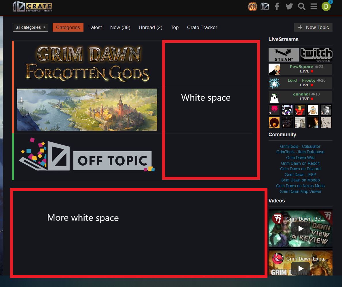
I might be color blind, but that ain’t white? It looks like gray to me.
Its not referring to color, the term is meant in web design as “unused space” or empty space
Yeah, so? The space below the Off Topic section isn’t empty btw. There are a couple of closed sections there available only to moderators/admin.
I am not a web designer, I am a humble teacher with phd in theoretial physical. I.e. just a regular nerd 
Well, that does not help the regular user and does not look that much better for us either.
This is second time I am seeing the homepage 
I open by default latest comments, so you’re flexible in that department.
Well if the solution is to avoid the homepage then you know there is a problem with it. I actually do have my bookmark on the FG section for that very reason but even still bad links will send you to the homepage anyways so you can’t avoid it all the time
The old forum had more sticky threads which made threads like this much easier to find
Not really. The only sticky for that part of the forum is the one for trading thread links of which there are only two active as the others died so didn’t get included. It’s pretty difficult to miss now imho.
As a returning player, I find the old forum layout easier to navigate. Just my honest opinion. 
Oh gawd…
You just switched to this abomination that they also went to in WoW forum ?
Seriously, how anyone can find this useable is beyond me, each thread is just one atrocious single neverending dynamically-loaded serie of posts. I absolutely LOATHE it, it makes following any conversation impossible and navigation is horrible.
Also I’m using 16/9 widescreen at home, maybe this displays adequately on some portrait smartphone but as for me I have a whole HALF of the screen which is unused.
As you might have guessed, I downright despise this forum. It’s not about “getting used” to it (as said, World of Warcraft made the switch years ago, and it’s still as bad as the first day), it’s just about being objectively bad, clunky and hard to follow.
Meh, I guess I’ll just completely skip it from now on.
What’s your point? You, me, and half the PC internet browsing peoples of the world are likely using that ratio. Not seeing an issue here. Readability is the same as any other forum and within less than a day I had successfully adapted to a different style than I had been used to and navigation became a non-issue. I imagine the first time I ever used the previous style it took a similar amount of time to break myself in fully to that method as well.
Go take a closer look at forums similar to the old-style. You’ll find that the majority of screen real-estate isn’t in use there either. Pssssssst: it’s literally how forums are made! Even the “less modern” ones.
People with this complaint are essentially deluding themselves on this front hoping to add an extra “bullet-point” in their war on the unknown. I know because I looked and they are more or less the same with post real-estate.

Me, too, and with zoom set to 120% in the browser it just looks right.
Don’t really see how it makes following the conversation more difficult. Yes, it scrolls, but you still have the same layout and answering system as before; it’s just not paginated. I wish we could have that too, but it doesn’t interfere with following anything. If you think this is bad try a discord channel and following that sometime. Makes this a piece of cake.