size of the orbs themself seem small to me. ui scale size does help some, but i would rather have the option to increase just the orb size instead of the whole ui
11 Likes
Yes, I think they should be abit bigger as well.
Agreed, compared to the rest of the hud I think they’re a bit small. It’s really noticeable after using the bars for a while and switching to the orbs.
They seem big enough to me. I think it’s a plus that they don’t take up much of the screen.
2 Likes
They don’t need to take up much of the screen but I do think they should be the most prominent part of the hud, aka the first thing that catches your eye when you look down at it. Currently, for me, that would be the center where the level and dodge is. I’ve seen some gripes with the spike in the center and I don’t necessarily agree with those, I think that part is fine as is. But, in my opinion, the orbs should be at least the same height as the spike. i’ve included some huds from different arpgs all with the orbs as the most prominent part and GD’s for comparison.


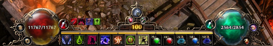
Stylistically, I enjoy GD’s the most. They knocked it out of the park. And in the end, if they choose to keep them as is, I’m not going to lose any sleep over it. But I do think increasing the orbs just a bit would help them catch the eye a little more.
8 Likes
Sorry, is it TQ2 right above Grim Dawn? 4th from the top?
Yes, that’s tq2.
If you hover over the images, I labeled them so folks would know what games they’re from
3 Likes
I don’t like this element at all. In my opinion, it should be spread out more to the sides, like in the refreshed classic UI. Overall, I’ll stick with the classic one, I don’t like the new one at all.

5 Likes
I think this also showcases the “a little bit too much shiny glare on everything” problem that the new UI has (in many cases) pretty well. The other orbs from the other games have some shiny/glary spot, but not quite as prominent as GD’s orb. Apart from that and the potentially distacting spike I think GD’s UI looks the best, but it could be even better with a little less shiny glare.
Most seem to be used to GD being a little dull / drab (not in a bad way) visually (apart from skill effects), so some of these new UI elements break with that tradition and thus seem too shiny.
8 Likes
Good luck, in hoping these will be changed…
Interesting to have them side by side like that.
I think GD and POE2 look best, though they have quite different approaches. And D3 shows that it’s from an earlier age.
1 Like
Yes, I think player buff icons can be bigger as well as orbs. Overall look of UI fantastic to me. But little adjustments will get this perfect ![]()
4 Likes
Why don’t you go complain to Steam? Your comments are getting tiresome and irritating.
4 Likes
Stylistically, they’re the best ones I’ve ever seen, but they are so small that they are practically unusable. You have to be able to see your health and energy in a glance, and you cannot do that here. And the shiny overlay (Constitution I suppose) on the health orb doesn’t help one bit, because it’s color is too similar to the experience bar color, so if you’re not strictly focusing on the health orb, you don’t see where the health begins and experience bar ends.
They need to be, like, twice as big as now. If they were, I would probably use them from time to time, because like I said, they do look very beautiful. But I have to say, health bars set Grim Dawn apart from most (all?) of its competitors and it’s kind of a nostalgic throwback to 2016, so I’m really glad they didn’t remove them from the game and allowed us to use them even after they designed these orbs.
5 Likes
Perhaps they could just provide a higher level of max scale so people can choose? Personally I find them very usable as they are and certainly wouldn’t want them to be twice as big (assuming you are talking about radius and not area).
I think being able to scale the hud separately from the rest of the UI might be a good solution. I’d still prefer the orbs to be increased a little bit but if they’re too large for a particular player, they can scale the hud down to their liking without effecting the rest of the UI.
2 Likes
Agree. I think if they leave only the “+” there and spread the rest will look better visually.
Thanks for comparison. I will add two D4 variants here: https://imgur.com/a/VfHu5j6
I´m happy that they created “left” options in D4. It was worse to play ARPGs when I moved from 16:10 monitor to 16:9 one because you move/aim in all directions. There were many 16:10 monitors for “1080p”, only few model for “1440p” and none for “2160p”. I miss 16:10 also for my work.
I will choose HUD in GD that will less interfere with my mouse movements in mid ![]()
Really hope for more custom sizing options for players.
1 Like
I’d like to add:
When you have to walk South, the orbs take up screen space that you can’t click on, otherwise your character won’t move.
Since clicking on the orbs has no UI function, maybe we can have it so at least your character still moves, when you accidentally click on the orb instead of the ground next to the orb.