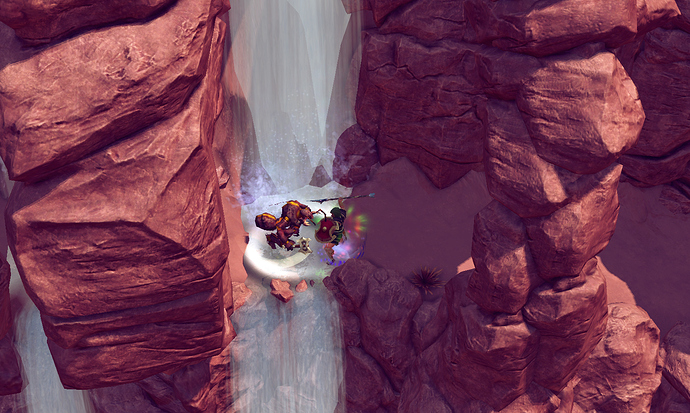
this brings some weird question: have you all ever encounter any enemy in arpg that drops the best loots, but you can’t stand their appearance/voice/personality?
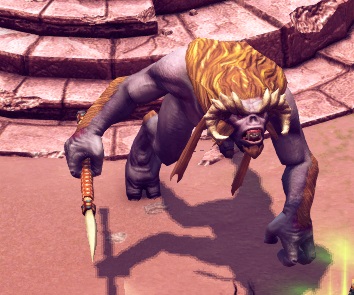
I understand about the “smooth” aspect. I’m actually of the opinion that for its age I think TQ aged kinda decent graphically. But whoever made that enemy sucks. It doesn’t even look remotely “cool”. The horns on the head look like a little talent went into them but once the artist finished those he just said “fuggit” for the rest of the design.
And I think lacr might be right that they just churned out the expansions to make a quick buck off the latent TQ community. They could of put some real work into it and maybe upgraded the engines visual capabilities a bit, among other things.
I’ve had an inner conflict going on since they started making these expansions. I want to get them. But when I see the shoddy artwork in Ragnarok and now this poor art design, it doesn’t sit well with me. And that’s a shame because TQ is the reason I didn’t have to think twice when I first heard about GD.
Just feels half-baked what Nordic/Pieces have been doing.
I don’t know what you don’t like about that artwork. I really like it and I say it looks very nice. You’re probably used to newer graphics, therefore your opinion is like this. I’ve always been playing on shit graphics, like Divine Divinity and other shit/weak graphics, and I really adore everything that looks shit, but I can’t say this monster you pointed out looks shit. I mean, they could use better colors, like not purple but, idk, black (whoa, racist!) or brown.
Why not just make a completely new game at this point? Upgrading engine and visual capabilities would literally require them to remake all models and textures, which all altogether would eat easily few months from their life. Also, no profit at all, unless they’d make this upgrade a DLC (which would be stupid).
I’d recommend to uninstall all games that have good graphics, so maybe all games that came out in 2006+ and play the graphically shitty games. To me, believe it or not, GD or Witcher have boring/bad graphics. Why? Because I am used to games being games, not real-life wannabies. In the case of GD, it’s just dark and boring, which takes away fun from me and bright and toon-ish graphics (if I even can call it “toon-ish”) add up a nice layer of fun. It’s like, I play games to have fun, to forget about real life, and the more I play dark-themed or HQ HD games (like Witcher) the more I think about real life.
Mmm. No. It’s not about the graphics quality, frankly. It’s about the poor artwork design on that enemy model, for instance. It flat out sucks and looks bad.
If you like bright children level cartoon artwork styles then have at it. There’s more than enough of those games out there in the world. I prefer my games darker and not targeted at tweens and under. And I, for one, am quite thankful Crate understood we didn’t graphically need another Torchlight.
ragnarok has ugly item textures upon release. reviewers noticed their bad visual quality compared to original tq items. then the devs improved those item textures after some time. maybe the same thing will happen to atlantis. just pressure the devs with ugly atlantis monster screenshot.
No need to pressure anything. Just gather a group (like a bigger group) of people that love TQ, make a poll what should have the textures changed and request how it could/should look. I once did that and it worked, there was no need of pressuring them, spamming that something should be changed. Just 1 week of gathering votes and one link to the developers.
And the link is here
https://redmine.thqnordic.com/projects/titan-quest-atlantis-community/
Not just for providing bug report info, but also for feedback and ideas/suggestions.
The only promblem they should remake whole terrible atlantis and half of ragnarok, while they cant even repair “invisible” relics -pathetic!
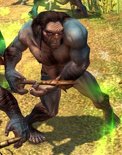
the Atlantis areas and monsters are similar to TQ in quality. You posting one pic does not prove anything - and even the monster you complain about in it looks similar in style to TQ’s neanderthals…
Atlantis to me is no worse than TQ and a pretty decent addition, Ragnarok on the other hand…
Lol, I have started this whole topic only after studying nordic so-called expansions. I have played GD at times when there was no darkvale gates yet. I have decided for myself that there is nothing to catch in GD, after ideal TQ, and forgot about both games 
Now, I see 2 expansions for GD and 2 so-called “expansions”(rather outrages) for TQ. I can easily compare them - i can smell how much work, efforts, blood and sweat are in the first ones and how some N. giving no shit while pressing some fabrications. Its like a knife over my veins, but what is even worse, that so many people are saying “nice levels, cool monster, excellent expansion” - with such an approach, N. will continue producing shit…
the GD expansions are better, hands down. I am no fan of Ragnarok and Atlantis is short (and the new skills mediocre at best)
But when you say the Atlantis art is 10 times worse than the TQ art, you are simply wrong, they are very comparable
[/quote]
I think the atlantis artists focused too much details on the face, mouth and horns. shame that the mane and HAIRLESS SMOOTH skin gives us nightmares.
Post similar images, not one with a camera mod and one without. At regular camera angle and zoom level they are similar (might have to do that myself as you show with each pic you post (and the pics / areas you choose not to post) that you are not objective…)
As to time passed, it is a 10 year old engine and they go for a similar style / quality to TQ, not something that is drastically superior in quality but therefore does not fit in with the rest (assuming the engine were up to that), so that to me is no argument at all.
do it - I have no time for obvious things, if you have no taste, they are really similar(someone has already wrote that 2 act in TQ is sands and nothing more) due to the similar polygon number and small texture size. But this wont make “nice levels, cool monsters”, if its outdated for you - both original TQ and nordic looks the same = bad. What is good and nice in new expansions?(QoL, skills, balance and such aside)
oh, so now you agree that the original TQ and the Atlantis models are similar in polygon count and texture quality when before A was 10 times worse than TQ ?
But this wont make “nice levels, cool monsters”, if its outdated for you - both original TQ and nordic looks the same = bad. What is good and nice in new expansions?(QoL, skills, balance and such aside)
I never said either one is bad or that both are. I like both vanilla TQ/IT and the art in A (won’t comment on R as I have not played it).
What is good about A ? It gives you more story and scenery which to me fits nicely with the TQ setting and art. So if you like TQ, I would expect that you also enjoy ‘more of the same’
oh, so now you agree that the original TQ and the Atlantis models are similar in polygon count and texture quality when before A was 10 times worse than TQ ?
Art is worse ten times than original T
Art, Design,Style, Aesthetic…
any BW movie with 240 quality has better picture than film made by me in 1080 quality with a modern cam, why so, how do you think?
What is good about A ? It gives you more story and scenery which to me fits nicely with the TQ setting and art.
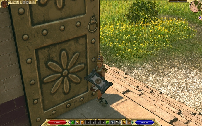
Lo and behold, here we are, standing at doors of grand city built by Herakles himself. Scenery doesnt fit, not nicely, it does NOT FIT AT ALL. Thats what I am about …
Lo and behold, here we are, standing at doors of grand city built by Herakles himself. Scenery doesnt fit, not nicely, it does NOT FIT AT ALL. Thats what I am about …
I guess we agree to disagree
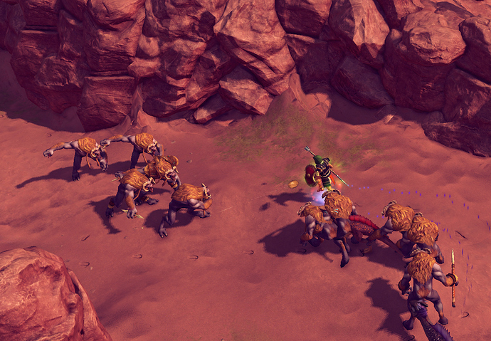
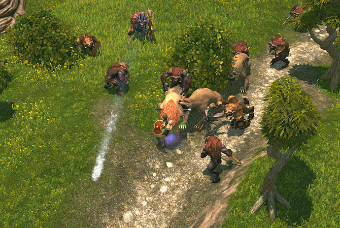
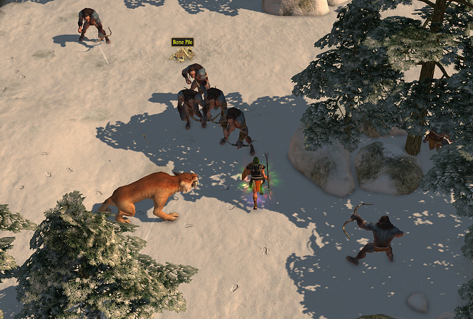
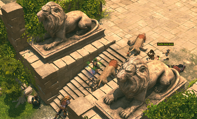
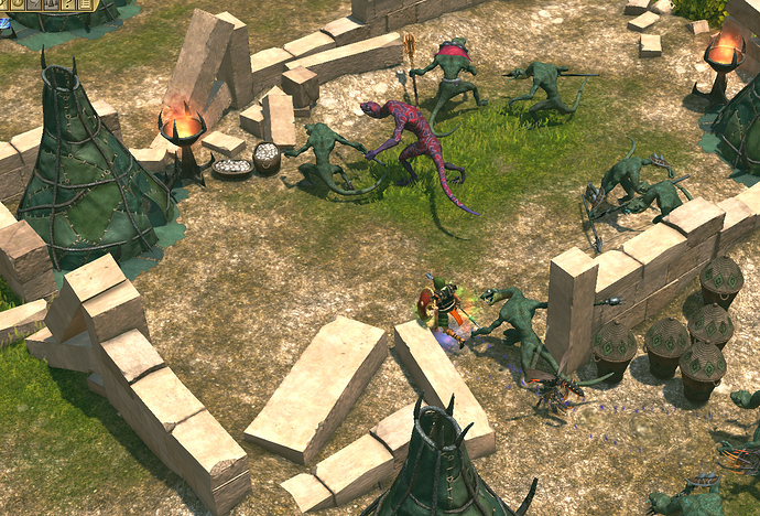
So here are the Neanderthals and their Atlantis counterparts the way you usually see them in game (i.e. not fully zoomed in with some camera mod)
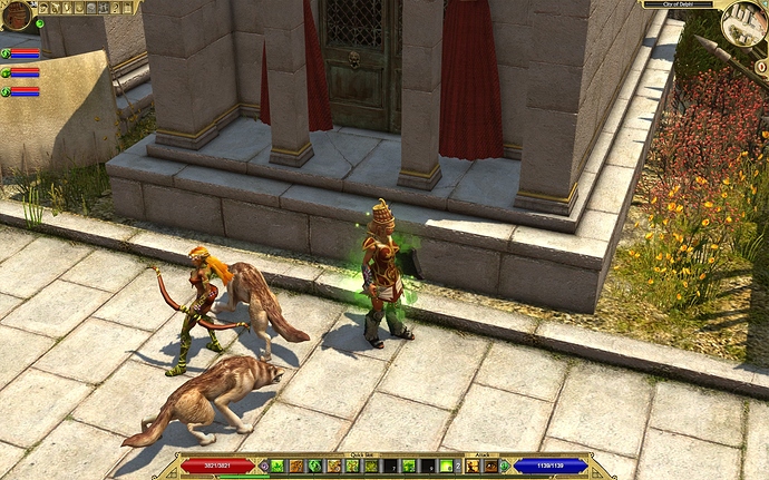
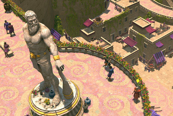
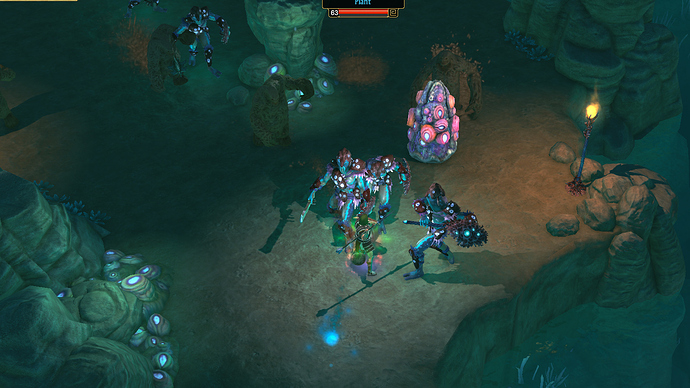
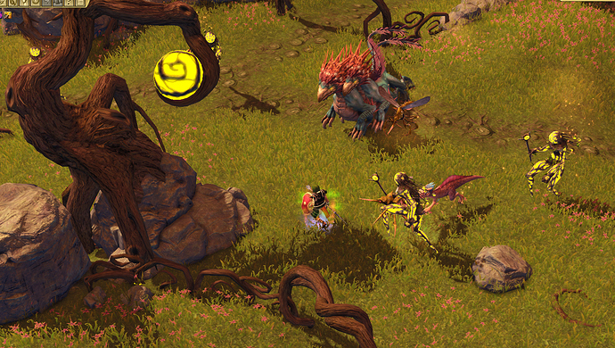
And for some more ideas about what the Atlantis areas look like…
Personally I thought the visuals of Atlantis were well done. Way better than Ragnarok and very close to Immortal Throne. Many of the new enemies aren’t reskins, which is awesome.
The biggest flaws with Atlantis that screwed over my enjoyment were…
-
no level scaling. Enemies are static, so if you bring an old char, prepare to stomp everything. After 10 years of playing TQ I don’t want to start a new character.
-
There is no incentive to playing Tartarus mode. The rewards are awful. After like 10 waves done (on release), my reward was something like 5k gold, no items whatsoever. I mean seriously, I could pick up any green item from any zone and earn more gold. I hope this was fixed because that is a serious issue.
-
Sound, again like Ragnarok, new enemies have this really obnoxious issue where their sounds dominate everything else in the game. Playing in MP, my friend kills an enemy 5 screens away, I hear the death sound as if the enemy were standing on top of me, louder than anything else in the game. This issue drives me crazy, I understand how it happened in Ragnarok the first time, sure they were rushing to get it out, playing with an old engine they didn’t quite understand, but the second time? That’s embarrassing. Even adjusting your volume you can never get the right levels, you just have to deal with it until they fix it. Playing on release Pieces Interactive TQ is like playing an EA title.
-
Targeting. I’m too accustomed to GD/POE/D3 targeting, aka modern ARPGs. The clunky targeting of TQ got old fast.
